
To fully understand the power of the Component Gallery, you have to create a catalog by yourself. I'll guide you through this process step by step. As an example, I'll use Visual GenRepoX, a public-domain tool I wrote to extend the functionality of the Visual FoxPro report writer. This tool is included with the Developer's Download Files at www.hentzenwerke.com, and future updates will be available from my Web site, www.eps-software.com. One problem with GenRepoX is that it has no real interface because everything happens programmatically. For this reason, many people have trouble getting started. The Component Gallery can help guide you through the tool. Not only is this an easy way for GenRepoX newcomers to learn, but it also allows experts to explore the whole GenRepoX functionality.
The first step is to create a new catalog file. Simply open the Component Gallery's Options dialog, click the Catalogs tab (page 2) and click New. Next, specify a file name (catalogs are regular DBF files), and voila . . . you're done.
The new catalog's name is the file name you specified. Typically you'll want to specify a descriptive and informative name. You can change the name by renaming the catalog item or modifying the item's properties (see Figure 22).
Figure 22. Folder properties of the topmost node of the new catalog.
The variety of options in each property sheet is discussed below. For now, we are only interested in changing some options in the General tab. Here we can change the name, the description and the picture for the catalog. Note that the caption of the dialog is "Folder Properties", even though we are looking at the catalog properties. I'm told this is by design. However, note that this property dialog is essentially different from the property dialogs of the subfolders.
The next step is to create a couple of folders in the catalog. I would like to have folders for the Classes and Programs belonging to Visual GenRepoX, a folder for Documentation, another for Samples, yet another for the GenRepoX Wizards, and finally a folder that allows the user to browse the Web (EPS on the Web). To create a new folder, right-click the Details panel, select New Item, and then select Folder (see Figure 23). All folders listed above are relatively simple to create. You only have to change their captions, descriptions and icons.
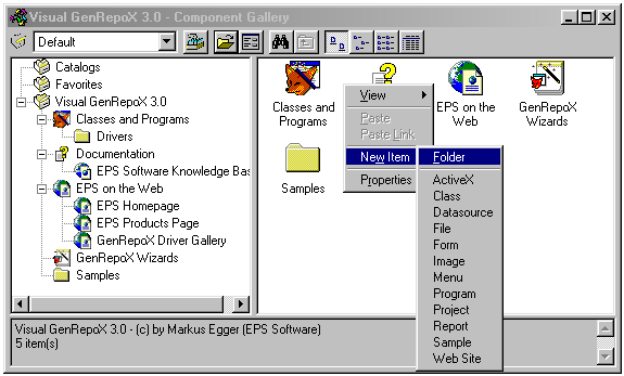
Figure 23. Creating a new folder.
Now let's add some items to the folders, starting with Classes and Programs. Figure 24 shows the desired contents of this folder. Basically, this is a summary view of the most important Visual GenRepoX components, which are GenRepoX.prg, an object wrapper for regular Visual FoxPro reports, a subclass of this report wrapper that contains all GenRepoX functionality, and a driver base class, which can be subclassed to create new drivers. There is another folder for existing drivers. Creating these items is straightforward. Right-click in the Details panel and select the kind of item you want to create.
This first folder already demonstrates some of the strengths of the Component Gallery. The created folder provides an overview of the most important Visual GenRepoX components. Without the Component Gallery, you'd have to search through the Visual GenRepoX class library where you'd find a dozen classes, two-thirds of which cannot be used or modified by the user. Then you'd have to find the GenRepoX.prg, which is somewhere on the hard drive. Finally, there are several class libraries with various drivers. Using the Component Gallery is a lot easier. The created catalog shows only the important items, and all of them are in one place. But not only does the Component Gallery show all those items, it also allows you to work with them. The gallery is aware of the different kinds of items it shows, and automatically provides appropriate actions for those items when the user double-clicks or right-clicks on the item. If you go back to Figure 23, you'll see a list of items the Component Gallery is aware of. You can extend this list with your own items if you're missing one. I'll demonstrate this later, using the example of a special GenRepoX report.
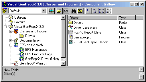
Figure 24. The contents of the Classes and Programs folder.
Dynamic folders
So far you've created only simple folders by adding items manually, but the Component Gallery also allows special kinds of folders, called dynamic folders. These folders can be direct links to a directory on the hard drive (see Figure 25), or even to a location on the Internet (see Figure 26).
When using dynamic folders to point to a directory on the hard drive, Windows Explorer is utilized to display the contents of the folder inside the Component Gallery.
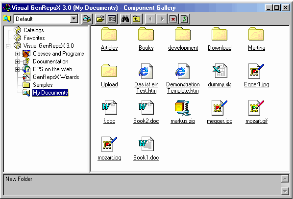 Figure 25. A dynamic folder pointing to C:\My Documents.
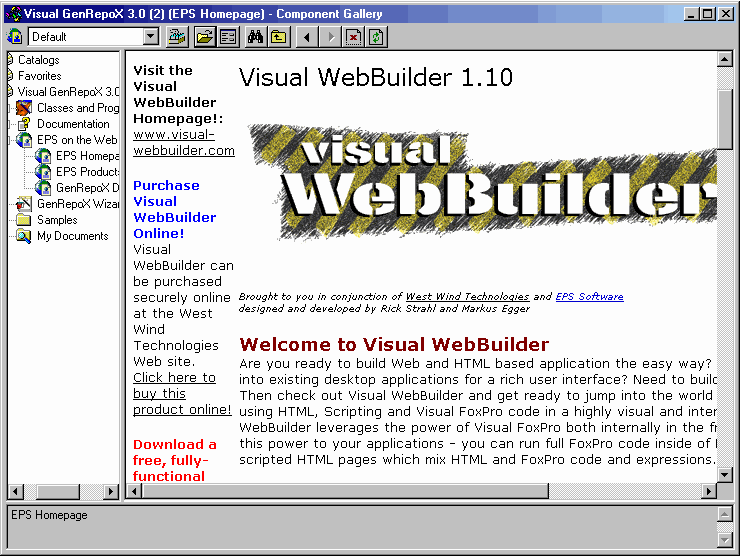
Figure 26
. A dynamic folder pointing to the Internet.To create a dynamic folder, you simply set the Dynamic Folder property in the Node tab of the folder's Properties dialog (see Figure 27). You can specify an Internet address (such as http://www.eps-software.com) or a directory on your hard drive (such as C:\My Documents).
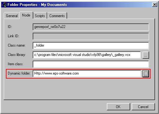
Figure 27. Creating a dynamic folder.
Now you also know how I created the links to the EPS Web page. I simply created dynamic folders that show the contents of my Web site. There is another way to do this: Instead of a dynamic folder, you could create a Web item. The difference is that dynamic folders are displayed in the Component Gallery, while Web items open an instance of Internet Explorer to display the desired Web page.
Creating links
Typically, a catalog shows the same item in more than one node. An example would be the Checkbox driver in the Visual GenRepoX catalog. (This example ships with Visual GenRepoX 3.0 in the Samples folder.) This is a useful driver, so it should also be in the Drivers folder. Creating the item twice wouldn't be a good solution because this would make the catalog hard to maintain. The better way is to create a link. To do this, first create the item for the Checkbox driver in the Drivers folder. Then right-click the item and select Create Link. The link is created in the current folder and looks just like the original item. The only hint that the item is a link is its name. Also, when you look in the Properties dialog of this new item (the linked one), all properties but the name are read-only.
You can now drag and drop the link into any folder you want.
Understanding item types
The strength of the Component Gallery is its flexibility, which is based on the great variety of different items the gallery can handle. The default list of items already handles the most important item types. However, you might want to introduce your own items. A good example is the Visual GenRepoX catalog created above. Even though Visual GenRepoX reports are regular FoxPro reports, they have to be executed slightly differently in order to allow GenRepoX to handle things differently and to extend the report writer's functionality. For this reason, you have to create a special item type that has the ability to execute those special reports. Later I'll explain how to do that, but before you can create our own items, you should understand how the Component Gallery handles item types.
How item types are handled
For every item displayed in the listview or treeview panel of the Component Gallery, the gallery internally instantiates another object representing the item's behavior. This object is responsible for managing the user interaction and for triggering and executing possible actions. For each item type, the Component Gallery uses a different class. These classes are stored in Vfpglry.vcx, located in the Home()+ '\gallery' directory. The source code for these classes, as well as the source code for a generic item class (which is the parent class of all other items), ship with Visual FoxPro. You can modify these items, or better yet, subclass them to provide your own functionality.
When you add an item to a catalog, you first select the item type, which also predefines the class the gallery is supposed to use. You can change this setting in the Node tab of the item's properties (see Figure 28). This way you could set up another item type that the gallery supports but that isn't exposed through the standard interface (see below), or you could invoke your own classes if you want different or new behavior (see below).
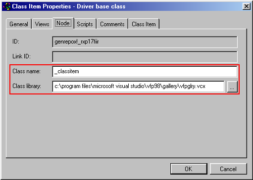
Figure 28. Specifying a class for the item behavior object.
When you double-click, right-click or drag and drop an item, the call is passed on to the underlying behavior object, which then decides what to do. This includes standard behavior like modifying or executing an item, as well as defining the right-click menu and executing complex tasks such as invoking wizards and the like. Many standard items share behavior that is coded in a shared behavioral object. You can call this object rather than executing actions directly in each individual object. You can also reference and use this object in your own behavioral objects (see below).
Standard items
The Component Gallery supports a number of standard items, only a handful of which are exposed through the interface. Table 3 lists all items stored in the Vfpglry.vcx and the _gallery.vcx class libraries. You can use these items in different ways: You can specify the class name in the Properties dialog of each item (Figure 28), you can add new item types to the standard interface (see below), and you can subclass the existing items to create new behavior.
Table 3.
Standard items that ship with Visual FoxPro 6.0.|
Item class |
Class library |
Parent class |
Description |
|
_activexfolder |
Vfpglry.vcx |
_folder |
Used for folders only. A folder based on this item type automatically displays all ActiveX controls installed on the system. |
|
_activexitem |
Vfpglry.vcx |
_item |
Used for ActiveX items, including ActiveX controls (OCX) as well as other COM servers (EXE/DLL). |
|
_catalogitem |
Vfpglry.vcx |
_item |
Allows you to link to other catalogs. |
|
_classitem |
Vfpglry.vcx |
_item |
Used for every Visual FoxPro class item. The class can be stored in a VCX or a PRG. |
|
_dataitem |
Vfpglry.vcx |
_item |
Used for any Visual FoxPro data source, including database containers (DBC), tables (DBF), and all kinds of views. |
Table 3
, continued|
_fileitem |
Vfpglry.vcx |
_item |
Every file can be managed through the Component Gallery using this item type. The Component Gallery reads the registry for more information about each particular item type and how to handle it. |
|
_folder |
_gallery.vcx |
_item |
A generic folder item. Subclass this class when you want to create your own folder class. |
|
_formitem |
Vfpglry.vcx |
_item |
Handles Visual FoxPro forms (SCX). |
|
_imageitem |
Vfpglry.vcx |
_fileitem |
A special kind of file item that handles all kinds of image files. |
|
_item |
_gallery.vcx |
_item |
All other item classes are subclassed from this class. Use this class as a parent class when you want to create your own item behavior classes. |
|
_menuitem |
Vfpglry.vcx |
_item |
Manages Visual FoxPro menus (MNX). |
|
_node |
_gallery.vcx |
_item |
Generic class used as a base for all kinds of items and folders. |
|
_programitem |
Vfpglry.vcx |
_item |
Handles all kinds of Visual FoxPro program files such as PRGs and header files (H). |
|
_projectitem |
Vfpglry.vcx |
_item |
Used to manage Visual FoxPro projects. |
|
_reportitem |
Vfpglry.vcx |
_item |
Used to manage Visual FoxPro labels (LBX) and reports (FRX). |
|
_sampleitem |
Vfpglry.vcx |
_item |
Can be used to run executable Visual FoxPro files such as EXEs, APPs, FXPs, PRGs, SCXs, FRXs and more. |
|
_shareditem |
Vfpglry.vcx |
_item |
Has some generic behavior that is called from various other items. |
|
_sounditem |
Vfpglry.vcx |
_fileitem |
A special kind of file item that handles sound files in WAV or RMI format. |
|
_templateitem |
Vfpglry.vcx |
_item |
Used to execute wizards. |
|
_urlitem |
Vfpglry.vcx |
_item |
Handles the navigation to all kinds of Web addresses that Internet Explorer can handle. This includes Web sites, HTML documents, Visual FoxPro active documents, Active Server Pages and more. The URL can be on the World Wide Web as well an on an intranet environment and even on your local hard drive. The URL also can be a directory name. In this case the result is a Windows Explorer-like view. |
|
_videoitem |
Vfpglry.vcx |
_fileitem |
A special kind of file item that handles video clips in AVI format. |
It is important to understand three basic item classes, which are _node, _item, and _folder. The _node class is the most basic and defines the common behavior of all kinds of items, whether items or folders. The _item class is a subclass of _node, and the _folder class is a subclass of _item. Tables 4 and 5 explain the _node class.
Table 4
. Properties of the _node class.|
Property |
Description |
|
_cVersion |
Contains some version information. |
|
AItemIndexes[x] |
If the item is a folder, this array contains the indexes of all sub-items. There is a collection of items in the gallery. You can use the indexes in this array to reference all the active items. |
|
Builder |
Used at design time only. It can define builders and extended builders (BuilderD) to be used with this item. |
|
BuilderX |
Used at design time only. It can define builders and extended builders (BuilderD) to be used with this item. |
|
cAlias |
Alias of the catalog cursor for an item or folder. |
|
cCatalog |
The file name of the current catalog. |
|
cCatalogpath |
Full path of the current catalog. |
|
cClass |
Default class used for all sub-items. |
|
cClasslib |
Class library that contains the definition of the current class. |
|
cClassname |
Class used for the current item. |
|
cClick |
Allows you to define an alternative method that handles the Click event. To redirect the call to a Test() method, set this property to oTHIS.Test(). |
|
cComment |
Comment as stored in the catalog. |
|
cDblclick |
Allows you to define an alternative method that handles the double-click event. |
|
cDesc |
Item description. |
|
cDragdrop |
Allows you to define an alternative method that handles the DragDrop event. |
|
cDragdrop2 |
Allows to define an alternative method that handles the Drop event of the class icon onto some target object. |
|
cFilename |
Name of the currently referenced file. |
|
cFolderpicture |
Bitmap or icon used for the current folder (if the item is a folder). |
|
cId |
Unique ID that identifies the catalog and the item. |
|
cId2 |
Catalog ID. |
|
cItemclass |
Class used for the behavior object. |
|
cItemclasslibrary |
Class library containing the class for the behavior object. |
|
cItemtpdesc |
Alternative item types for certain files (redirect). |
|
cItemtype |
Display name of the current item type. |
|
cKeypress |
Allows you to define an alternative method to handle the KeyPress event. |
|
cKeywords |
Keywords that identify the current item. |
|
cLink |
Optional ID that links the current item to another item. |
|
cObjecttype |
Item type. |
|
cOledragdrop |
Allows you to define an alternative method to handle the OLEDragDrop event. |
|
cOledragover |
Allows you to define an alternative method to handle the OLEDragOver event. |
|
cParent |
String that describes the parent object (folder). |
|
cPicture |
Item image (icon or bitmap). |
|
cProperties |
Property settings specified in the scripts. |
|
cRightclick |
Allows you to define an alternative method to handle the right-click event. |
|
cScript |
Script source of the current item. |
|
cScriptmethod |
Internal. |
|
cSourcealias |
Alias of the table that defines the current item. |
Table 4
, continued|
Property |
Description |
|
cSourcecatalog |
File name and path of the current catalog. |
|
cSourcecatalogpath |
Path of the current catalog. |
|
cStatusbartext |
Text displayed in the status bar. |
|
cTarget |
Internal. |
|
cText |
Item text. |
|
cTooltiptext |
The item's tooltip text. |
|
cType |
Specifies whether the current node is an item or a folder. |
|
cTypedesc |
Specifies the type description text for all child items/folders of a folder. |
|
cUser |
Specifies the user text for an item/folder (unused by the gallery). |
|
cViews |
Specifies the views list for an item/folder. |
|
enabled |
Indicates whether the item is enabled (.T./.F.). |
|
lCatalog |
Indicates whether the current item is a catalog. |
|
lDeleted |
Indicates whether the current item has been deleted. |
|
lDynamic |
Indicates whether the current item is a dynamic folder. |
|
lFolder |
Indicates whether the current item is a folder. |
|
lFolderitem |
Indicates whether the current item is a folder item. |
|
lFullpath |
Specifies if various file name properties for an item/folder are automatically full pathed. |
|
lGetfileaddress |
Specifies if the file name is a file addresss. |
|
lObject |
Specifies if the current item is type OBJECT. |
|
lRelease |
Specifies that the item's Release method has been executed. |
|
lRuncodemode |
Specifies that the item is currently in the RunCode() method mode. |
|
lScriptmode |
Specifies that the item is currently in the RunScript() method mode. |
|
lView |
Specifies that the item is type VIEW. |
|
nIndex |
Index of this item. |
|
nItemcount |
Number of sub-items. |
|
nItemindex |
Specifies the item index of the item in the TreeView/ListView object. |
|
nNodeindex |
Specifies the node index of the item in the TreeView/ListView object. |
|
nRecno |
Absolute record number in the current catalog table. |
|
nSourcerecno |
Internally assigned record n umber (stored as regular data in the catalog table). |
|
oAction |
Reference to an object that is delegated to for all actions such as Click, DblClick, etc. You can hook a custom object that has these methods to oAction of an item, and the events for that item will be delegated to the oAction object. |
|
oControl |
Specifies the TreeView or ListView parent object of the item node object. |
|
oFolder |
Reference to the folder this item belongs to. |
|
oHost |
Reference to the Component Gallery. |
|
oLink |
If the object is a link, this is a reference to the real item. |
|
oNode |
Reference to the TreeView or ListView node object for the item. |
|
oObject |
Object reference to a VFP object used for objects of type OBJECT. |
|
oParent |
Reference to the parent object (parent folder). |
|
oRecord |
Specifies the SCATTER NAME object from the catalog cursor table record for the item. |
Table 4
, continued|
Property |
Description |
|
oShortcutmenu |
Reference to the shortcut menu definition. |
|
oSource |
Specifies an object source reference during a drag-and-drop operation. |
|
oTarget |
Specifies an object target reference during a drag-and-drop operation. |
|
tUpdated |
Date and time when the item was last updated. |
|
visible |
Specifies whether the current item is visible. |
|
vResult |
Used internally by the gallery for returning variant return values from method calls. |
Table 5
. Methods of the _node class.|
Method |
Parameters |
Description |
|
Click |
Method that handles click events. |
|
|
DblClick |
Method that handles double-click events. |
|
|
DragDrop |
oSource, nXCoord, nYCoord |
Method that handles drag-and-drop events. |
|
DragDrop2 |
oSource, nXCoord, nYCoord |
Method that handles the target drop event from dragging the class icon to a target. |
|
FullPath |
tcFileName, lcNewFileName |
Returns a full path of a file name relative to the item's catalog folder location. |
|
GetFile |
tcFileExt, tlAutoExtDialog |
Returns a file name from a user dialog. |
|
GetFileAddress |
TlNoShellExecute, tcFileExt |
Returns a URL from a user dialog. |
|
InitProperties |
Internal. |
|
|
KeyPress |
nKeyCode, nShiftAltCtrl |
Method that handles keypress events. |
|
NewInstance |
Returns a new instance of an object based on the same class of the object (new _Item, new _Folder). |
|
|
Properties |
Can be called to programmatically display the property sheet. |
|
|
ReadProperties |
Reads the properties from the catalog Properties memo field into the cProperties property and sets the relative properties. |
|
|
Refresh |
Handles refresh events. |
|
|
RefreshFolderPicture |
Refreshes the folder image. |
|
|
RefreshPicture |
Refreshes the item's image. |
|
|
Release |
Handles release events. |
|
|
ReleaseObjects |
Releases all object references for a node object. |
|
|
Remove |
tlConfirm, tlNoRefresh |
Handles remove events. |
|
RightClick |
Handles right-click events. |
|
|
RunCode |
TcCode |
Executes a code snippet. |
|
RunScript |
TvItem |
Executes a Visual FoxPro script. |
|
ScriptHook |
TcProgram |
Specifies a script hook program to be specified when running a script. |
|
SetProperties |
TcProperties |
Sets properties specified in the cProperties property to their associated values. |
|
WriteProperties |
TlUpdateSource, tlAutoAdd |
Writes the various item properties to the catalog Properties memo field. |
Beyond the basic functionality the _node class provides, the _item class has some specialized behavior for all kinds of items (including folders). You should subclass this class rather than the _node class if you want to create a new item type. Tables 6 and 7 explain this class.
Table 6
. Properties of the _item class.|
Property |
Description |
|
cFormclasslibrary |
Specifies the form class library. |
|
cItemtypedesc |
Specifies the item type description. |
|
cMethod |
Specifies the method to edit when opening the Class Designer for a class item. |
|
cRightclickmenu |
Specifies a program to run for the right-click menu event. |
|
lAutosetmenu |
Specifies that the code in SetMenu is automatically used to initialize the right-click shortcut menu for an item. |
|
lDefaultmenu |
Specifies whether default menu items such as Cut, Copy and Paste should be displayed. |
|
lModify |
Specifies whether the current item can be modified from within the Component Gallery. |
|
lNewmenu |
Specifies whether the default menu has a "New" item. |
|
lPastemenus |
Specifies whether the default menu has a "Paste" item. |
|
lPropertiesmenu |
Specifies whether the default menu has a "Properties" item. |
|
lRightclickmenu |
Specifies whether the current item has a shortcut menu. |
|
lWebview |
Specifies whether the current item requires Internet Explorer to display some dynamic content. If this is the case, the Component Gallery changes significantly. The standard toolbar buttons are replaced by typical browser buttons such as Refresh, Stop Loading, and Back. |
Table 7
. Methods of the _item class.|
Method |
Parameters |
Description |
|
About |
Displays an about dialog for an item (optional). |
|
|
AddDefaultMenu |
ToObject |
Adds a default shortcut menu to the current item. |
|
AddMenuBar |
tcPrompt, tcOnSelection, tcClauses, tnElementNumber, tlMark, tlDisabled, tlBold |
Adds a menu bar to an existing shortcut menu. |
|
AddMenuSeparator |
TnElementNumber |
Adds a menu separator to the existing shortcut menu. |
|
AddPasteMenus |
toObject, toMenuObject |
Adds Paste menu items to the current shortcut menu. |
|
AddPropertiesMenu |
toObject, toMenuObject |
Adds the Properties item to the current shortcut menu. |
|
AfterLabelEdit |
cancel, newstring |
Fires when the user finishes editing a label. |
|
ClearMenu |
Deletes the current menu definition. |
|
|
Copy |
Copies the current object. |
|
|
CreateLink |
Creates a link to the current object. |
|
|
Cut |
Cuts the current object. |
|
|
Disable |
Disables the current object. |
Table 7
, continued|
Method |
Parameters |
Description |
|
Enable |
Enables the current object. |
|
|
Help |
Activates the help for the current object. |
|
|
Hide |
Hides the current object. |
|
|
Modify |
Starts the appropriate editor for the current item if the item can be modified. |
|
|
NewMenu |
Creates a new shortcut menu. |
|
|
OLECompleteDrag |
oControl, nEffect |
Handles the OLECompleteDrag event. |
|
OLEDragDrop |
oControl, oDataObject, nEffect, nButton, nShift, nXCoord, nYCoord |
Handles the OLEDragDrop event. |
|
OLEDragOver |
oControl, oDataObject, nEffect, nButton, nShift, nXCoord, nYCoord, nState |
Handles the OLEDragOver event. |
|
OLEGiveFeedBack |
oControl, nEffect, defaultcursors |
Handles the OLEGiveFeedBack event. |
|
OLESetData |
oControl, oDataObject, eFormat |
Handles the OLESetData event. |
|
OLEStartDrag |
oControl, oDataObject, nEffect |
Handles the OLEStartDrag event. |
|
Open |
Method to open an item (defined at item type level). |
|
|
Paste |
Pastes the item that is currently in the clipboard. |
|
|
PasteLink |
Pastes the link that is currently in the clipboard. |
|
|
QuickView |
Activates the quick view for the current item. |
|
|
Rename |
Starts an item-rename operation. |
|
|
Run |
Executes items. |
|
|
SetFocus |
Handles the SetFocus event. |
|
|
SetMenu |
Sets the shortcut menu items for an item. |
|
|
Show |
NStyle |
Handles the Show event. |
|
ShowMenu |
Activates the shortcut menu for the current item. |
|
|
UpOneLevel |
Navigates to the parent item (folder). |
Folders are special item types. The default folder class is _folder, which is a subclass of the _item class. This class has some highly specialized behavior for folders. Tables 8 and 9 explain these special item types.
Table 8
. Properties of the _folder class.|
Property |
Description |
|
cFolderType |
The information stored in this property gives an indication of special folder types, such as dynamic folders that can point to an Internet URL. In this case the value of this property would be "web". |
|
lSearchSubdirectories |
Specifies that the dynamic folder will search all subdirectories, which will create a sub-dynamic folder for each subdirectory found. This is optional and might slow down the refreshing of the gallery. |
|
lSortOnCleanup |
Specifies whether a folder should be sorted when the user issues a "Cleanup catalog". |
Table 9
. Methods of the _folder class.|
Method |
Parameters |
Description |
|
Backup |
TcFileName |
Creates a backup of the selected catalog if the current folder is the main catalog folder. |
|
Cleanup |
tlNoRefresh, tlIgnoreErrors |
Executes a cleanup of the current catalog. This includes packing the table and reordering items. This method executes only if the current folder is the main catalog folder. |
|
Find |
Displays the Find dialog. |
|
|
GetFolderType |
Gives an indication about special folder types, such as dynamic folders that can reference a URL on the Internet (return value is "web"). |
|
|
InitDBCFolder |
Initialize the DBC folder of a dynamic project folder. |
|
|
InitFileFolder |
Initialize the files of a dynamic folder. |
|
|
InitFolder |
Initialize a dynamic folder. |
|
|
InitPJXFolder |
Initialize the PJX folder of a dynamic folder. |
|
|
InitVCXFolder |
Initialize the VCX folder of a dynamic project folder. |
|
|
Restore |
TcFileName |
Restores the current catalog from an earlier created backup. This method executes only if the current folder is the main catalog folder. |
Creating new items
As an example, I want to use my Visual GenRepoX catalog again. I'd like to add some sample reports to the Samples folder. Of course, those reports aren't regular Visual FoxPro reports. Visual GenRepoX has to be invoked before the report can be previewed. All other report functionality, like modifying a report, is the same as with regular Visual FoxPro reports. For this reason, I simply subclass the _reportitem class. I call the new class cGenRepoXReportItem. The _reportitem class has a Run() method, which is the method that needs to be changed. In fact, I'll get rid of the original behavior altogether and overwrite it with the following code:
** Overwrite the default behavior...
LOCAL lcCommand
lcCommand = ["REPORT FORM "]+Alltrim(THIS.cFileName)+[" PREVIEW]
GenRepoX(lcCommand)
Instead of executing the report directly, I route the call through the GenRepoX wrapper. For simplicity's sake, I call the GenRepoX function instead of the GenRepoX object, even though this would be the proper way now. After all, I want to show you how the Component Gallery works—not how to properly invoke GenRepoX.
I can now add a report item and specify this class as an item class. When I right-click such an item and select Preview from the shortcut menu, the new method fires and GenRepoX gets called. Quite simple, isn't it?
The next step is to modify the menu, because we want to give the user a clue that we are doing something different. Here's the code:
LPARAMETERS toObject
IF NOT _item::SetMenu(toObject)
RETURN .F.
ENDIF
IF !THIS.oShared.CheckItem(THIS)
RETURN .F.
ENDIF
this.AddMenuBar("Modify","oTHIS.Modify()",,,,,!this.oHost.lRunFileDefault)
this.AddMenuBar("Preview GenRepoX)","oTHIS.Run()",,,,,this.oHost.lRunFileDefault)
First of all, I am executing inherited behavior. Note that I'm not using DoDefault(), but the scope resolution operator. I do this because I don't want to inherit the items defined in the _reportitem class. However, all menu items should be defined generically in the _item class. For this reason, I skip the direct parent class and go one step higher. In the next step, I check whether the current item can be handled by the shared item because I still want to let the shared item handle standard tasks such as modifying the class. You might wonder why I knew I had to do this. Well, I actually didn't. I just looked it up in the _reportitem class and figured it must be there for a reason.
Finally, it's time to add an item to the shortcut menu. I simply used the AddMenuBar() method. The first parameter is the caption. Parameter two defines the action that occurs when the item is selected. When a right-click menu is created, the gallery stores a reference to the active object in a public reference called oTHIS. So with oTHIS.Modify() and oTHIS.Run() we send messages to the current object. And remember that I changed the code in the Run() method. So this is how this method gets called.
The final parameter is a little confusing. It defines whether the added menu item should be displayed in boldface. In the Component Gallery options, the user can specify the default item action (either modify or run). Our menu should show the default action in boldface. So the first thing I have to do is figure out the option setting, which is stored in the gallery itself. I always have a reference to the gallery called oHost. The actual setting is stored in a property called lRunFileDefault. This setting is simply passed to the AddMenuBar() method.
By now you know how to modify behavior and how to set items in the menu. You also know how to link those items to a certain method, so you could easily create new methods and add menu items that call those methods. With this knowledge, you're limited only by your creativity.
Adding item types
By default, the Component Gallery supports only a dozen item types, but you'll often want to add new ones. You might want to add items and change the underlying classes to get different behavior, or maybe create a catalog that deals with non-default behavior, like the Visual GenRepoX catalog. In this case, it is much more comfortable to add new item types.
Adding new item types is done per catalog. You can do it through the Properties dialog of the main catalog node (see Figure 29).
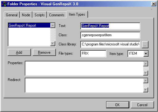
Figure 29. Adding item types.
When creating a new item type, you need to specify an item type name, a class and a class library to be used for the behavior object, and whether the new item is a folder or a regular item. Optionally, you can specify properties and alternative item types (redirect). Items often need certain properties that the user can change, which you can specify in the Properties edit box. In the previous example, we could add a property that allows setting the file name:
Report file name,cFileName
When the user adds a new GenRepoX report item, he can now open the item's properties and see another page that allows him to specify the item name. I'll discuss this topic in more detail later.
We can also specify alternative item classes in the current dialog. Let's say the user incorrectly selects a DOC file as a GenRepoX item. We could redirect this item to a regular file item like so:
DOC=_fileitem
Once a new item type is added, it is available in the right-click menu as well as in the treeview (see Figure 30). But remember that items are defined per catalog. It sometimes gets confusing when you open multiple catalogs and one catalog supports items that are unsupported by the other.
Folder and item properties
Each item and folder in the Component Gallery has a Properties dialog that allows you to modify and customize the behavior, look and feel of each item. For most items, the property sheets will vary in appearance due to the flexibility of each item. I'll give you an overview of the most important items and their different property sheets. I'll also explain how to customize the items and their property sheets.
The property sheets I describe here are advanced property sheets. You can activate advanced property sheets in the Component Gallery's Options dialog (Advanced editing enabled). If you don't activate this feature, the property sheets will have significantly fewer items.
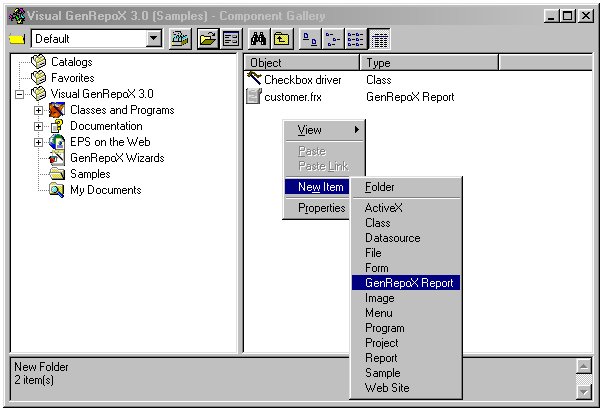 Figure 30. The "GenRepoX Report" item that was defined in the
Visual GenRepoX catalog.
Catalog properties
Figure 31
shows the General tab of a sample catalog property sheet. On this tab, you can define the most basic properties such as the catalog name and a short description, as well as an item for the catalog. The catalog's property sheet is a specialized form of a folder property sheet. Take note that the specified name is used for the topmost node as well as for the whole catalog (in the Open dialog, for instance). The General tab allows you to specify two additional properties—the item picture and an item description. These settings are used for items within the current catalog that don't have specific icons and descriptions assigned.On the Node tab of the property sheet (see Figure 32), you can specify some internals for the catalog node. The ID is the automatically created name of the actual node. This property is always read-only. The Class name and Class library properties allow you to specify the class to be used internally (see above). The Item class is a standard class for all items that don't have a defined class. Finally, the Dynamic folder property defines the location of a dynamic folder (see above).
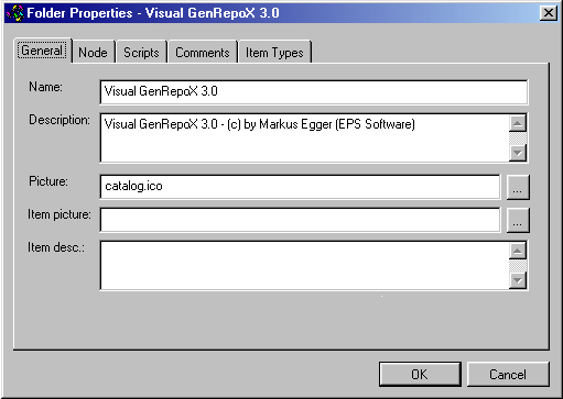
Figure 31. The General tab of the catalog property sheet.
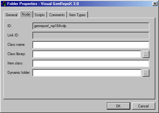
Figure 32. Customizing some internals of the folder using the Node tab.
The Scripts tab is used to maintain scripts and property settings. This topic is discussed below. On the Comments tab, you can add personal comments and modify the contents of the User field of the catalog. Finally, there is the Item Types tab, which is used to add custom item types to a catalog (see above).
Folder properties
Folder properties are similar to catalog properties. The major difference is that they do not have an Item Types tab. Also, properties such as the folder name have less impact than the catalog properties because they only define local names.
Item properties
Item property sheets are also similar to folder and catalog property sheets, but they have some additional tabs and omit some generic settings. On the first tab, you can set properties for the name, description and item image. Sub-item images and descriptions can't have properties because items (unlike folders) can't have sub-items.
The first new tab is Views, which allows you to influence how an item is displayed
and how it can be found. You can specify a list of keywords, which can then be used in the Search dialog to define dynamic views based on one or more keywords. The View settings are a bit confusing at first, but helpful nevertheless. The Visual FoxPro standard catalog has a good example for View settings. It has a Dialogs folder that contains an About Dialog item. Now let's assume the user wants to use the "Class By Type" view. In this case, the About dialog should be listed as a form. This can be accomplished with the following setting in the Views property:Class By Type=Forms
The Node tab is a simplified version of the Node tab in the folder and catalog properties. It allows you to specify classes for the current item, but not for sub-items. The Script and Comments tabs are identical to the ones in the folder and catalog properties.
In addition, there typically is one more tab that has some properties specific to the current item. Class items have properties that show the base class, class locations, and so on. URL items have the Web address and so forth. This special property tab can be customized if you create special items that have some properties that need to be set by the user. See below for more information about custom properties.
Creating custom properties
Often you will want your users to set some properties. The GenRepoX example is a perfect example. In the special GenRepoX report item, we overwrote the Run() method to execute a GenRepoX report by calling the GenRepoX method. However, there might be a need to execute a GenRepoX report directly without invoking GenRepoX. People like to do that to see whether a report can still be executed without GenRepoX. For this reason I decided to create a new property called lUseGenRepoX in the cGenRepoXReportItem class. Now I need to register this property with the Component Gallery so it will be displayed in the Properties dialog. I can do this two different ways: One allows the user to remove the definition, and the other is done internally and can't be removed from the property sheet by the user.
First I'll describe the secure way of registering the property, which prevents the user from removing it. To do this, I have to open the catalog like a regular DBF and manually add a record (see below for an explanation of the table structure). The Type field must be "CLASS". The ID is simply a unique value. The next couple of fields remain blank. The TypeDesc has to be "ITEM" because I want to create new properties for an item. It could also be "FOLDER" if I wanted to create folder properties. The magic actually happens in the Properties field. Here's what I added there:
Use GenRepoX to preview,lUseGenRepoX
Copies,nCopies
The first value up to the comma is the text that will be displayed. After the comma, I specify the property name. In this example I created a second property that specifies how many copies should be printed by default. The gallery allows you to specify as many properties as you want, separating them with a carriage return. Note that the properties are of different types—the first is logical and the second is numeric. The Component Gallery handles different property types automatically.
Now there is only one thing left to connect this record to a specific class. We do this in the Class and ClassLib fields, where we specify the appropriate name. In this example, the class name would be cGenRepoXReportItem and the library is the name of the VCX file we've chosen to store our class. Figure 33 illustrates our property sheet.
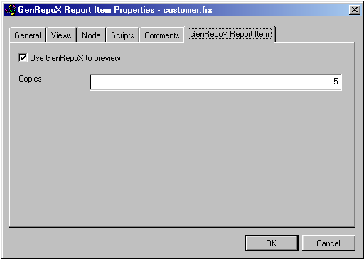
Figure 33. A custom tab in the property sheet.
Properties also can be specified in the Item Type tab of the catalog properties (see above). You simply specify some descriptive text and the name of the property. If the behavior object doesn't have the specified property, the property definition is ignored (unlike in the internal descriptions where this would cause an error). Note that this works only for newly defined items. Properties for internal objects can only be defined low level in the catalog DBF.
Once I allow the user to set certain properties, I can react to them in the Run() method (or other methods) of my special report class like so:
LOCAL lcCommand
lcCommand = ["REPORT FORM "]+Alltrim(THIS.cFileName)+[" PREVIEW]
IF THIS.lUseGenRepoX
GenRepoX(lcCommand)
ELSE
&lcCommand
ENDIF
In this example I support only one of the two properties, but I think you get the idea.
Scripting
You might need to customize some properties or some behavior, but if the change is small (or located only at one place) you might not want to create a new class. In this case you can utilize the Component Gallery's scripting capabilities. You can define scripts on the Scripts tab of an item's property sheet (see Figure 34). This tab allows two different types of scripts. One allows setting properties (you guessed it: this is the edit box with the caption "Properties:"), and the other allows creating entire FoxPro functions. Properties are set one by one. You can specify as many property settings as you want, separating them with a carriage return (new line). I could set my lUseGenRepoX property like so:
lUseGenRepoX = .F.
This would set to .F. the behavior's lUseGenRepoX property (which normally defaults to .T.). Without the script, I always had to go to the property sheet to set this property before I printed. You can access every public property of the current behavior object. The gallery simply adds the defined property expression to the object name and evaluates it. Remember that each behavior object also has links to other objects, such as the parent node, the host (which is the Component Gallery itself), and so forth. So you could easily set properties of the Component Gallery like so:
oHost.BackColor = 255
This would set the Component Gallery's back color to red, as soon as the behavior object gets instantiated (which happens as soon as the user looks at a folder that contains the item with the script). This can be very useful to interact with add-ins that you might have created for the gallery (see below).
Properties can also be used to redirect method calls. To use the user-defined Test() method to handle the Click event, you could redirect it like so:
CClick="oTHIS.Test()"
For simple tasks, you can also use a Visual FoxPro script, which is a regular Visual FoxPro function. You can use all kinds of structures, such as IF and CASE statements. The only limitation is that you cannot define sub-structures like other function or class definitions. Unlike regular Visual FoxPro code, scripts are not compiled; instead, they are executed and interpreted line by line, similar to Visual Basic or Java scripts.
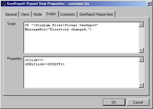
Figure 34. A simple script and two redirected method calls.
To call a script, you have to redirect a method call, similar to the last example, but instead of setting a method name you would specify a script call in the properties:
CClick=<>
Because no ID was specified between the brackets, the script specified in the current item is executed. Let's say we want to use the script to set the default to a certain directory every time the user clicks an item. We would create a script similar to the following:
CD "\Program Files\Visual GenRepoX"
MessageBox("Directory changed.")
Figure 34 shows how this is specified in the property sheet. Take note that you can specify only one script in a property sheet. If you wanted to create another script for a different event, you'd have to add another record to the component catalog—something you could only do low-level in the DBF file. Additional script records have the type SCRIPT, a unique item ID that will be used to reference the script, and the actual script in the Script field. Let's assume you created a script record with the ID SCRIPT1. You would call this script with the following setting in the properties:
CRightClick=<SCRIPT1>
Take note that redirecting methods overwrites the default behavior assigned to a certain event. The above example redirects the right-click event. This means that the default behavior (like the shortcut menu) is now disabled. Unfortunately, there is no equivalent of DoDefault() in scripts or other redirected methods.
Add-ins
Like the Class Browser, the Component Gallery itself can be customized through add-ins. I explained add-ins in detail in the Class Browser section. However, I'd still like to give you a simple example of a Component Gallery add-in. I would like to add a button to the gallery that scans the current folder for GenRepoX report items and executes all of them. Here is the code that does that:
LPARAMETERS loGallery
loGallery.AddObject("cmdGenRepoX","cPrintReportsButton")
RETURN
DEFINE CLASS cPrintReportsButton AS CommandButton
FontName = "MS Sans Serif"
FontSize = 8
Height = 23
Width = 100
Caption = "GenRepoX Exec."
Visible = .F.
FUNCTION Visible_Assign (llNewVal)
IF Type("llNewVal") = "L" AND llNewVal AND NOT THIS.Visible = llNewVal
* The button is set visible
THIS.Top = THISFORM.chkDetailsView.Top
THIS.Left = THISFORM.chkDetailsView.Left + ;
THISFORM.chkDetailsView.Width + 5
ENDIF
THIS.Visible = llNewVal
ENDFUNC
FUNCTION Click
LOCAL lnCounter
FOR lnCounter = 1 TO ALen(THISFORM.oFolder.aItemIndexes,1)
IF "genrepox" $ ;
THISFORM.aItemList(THISFORM.oFolder.aItemIndexes(lnCounter)).Class
THISFORM.aItemList(THISFORM.oFolder.aItemIndexes(lnCounter)).Run
ENDIF
ENDFOR
ENDFUNC
ENDDEFINE
The code has to be stored in a PRG file. For now, I'll assume you stored it in a file called Grxaddin.prg. You can now run the Component Gallery and register the add-in like so:
_oBrowser.AddIn("GenRepoX Execute","grxaddin.prg","INIT")
Note that the reference to the gallery is still called _oBrowser. That's because the gallery and the browser share underlying architecture as well as the interface. I would like to see a second object reference called _oGallery, but apparently nobody else thought of this before. If you would like such a reference, too, you can create a simple add-in that defines a public variable called _oGallery and turns it into an object reference pointing to _oBrowser. This add-in needs to be called in the Activate event of the gallery.
When the add-in is executed, the new button gets instantiated. However, the button is invisible at first because I don't want it to show up unless a GenRepoX item is displayed. For this reason I have the GenRepoX item activate the button. To do that, I could either code something in the Init() method of the GenRepoX behavior class, or I can create a little script (actually a property setting) that sets the Visible property of the button to .T. This can be done in the property sheet of any GenRepoX item, like so:
oHost.cmdGenRepoX.Visible = .T.
When the button is set visible, an assign method fires and handles the positioning of the button according to other items in the gallery.
When the button is clicked, I iterate through the current items, check if they have "genrepox" in their class names, and if so, I fire the item's Run() method to execute the report. Iterating through the active items is simple. The gallery has an object reference called oFolder, which is a reference to the currently selected folder. This folder object has an array of item numbers that are members of the folder. We can use these numbers to reference items in the gallery's aItemList collection. This collection has a reference to all the behavioral objects the gallery has instantiated so far. Take note that there could be items from other folders as well, because the gallery creates behavior objects as soon as a folder is browsed, but no longer removes them for performance reasons. Once we have a reference to the items in the selected folder, we can check their Class property to see whether the item is related to GenRepoX.
The gallery's object model
The internal object model of the Component Gallery is quite rich. Full documentation of the internal object model is beyond the scope of this book. Please refer to the Visual FoxPro documentation. However, I would still like to give you an overview of the most important references and properties of the Component Gallery (see Table 10). You can access those properties either from add-ins or through the _oBrowser object reference (yes, the reference to the gallery is also _oBrowser, since the two tools share one interface).
Catalog file structure
Component Gallery catalogs are regular Visual FoxPro tables (DBF). Most content in a catalog can be edited through the Component Gallery's interface. However, some data (such as custom property sheets or scripts) have to be defined as low level in the DBF. Also, there are other reasons for editing the file directly: corrupt content, or mass updates that can be done with a REPLACE ALL…FOR statement. Table 11 explains the structure of catalog tables.
The Component Gallery has a default catalog—Vfpglry.dbf—that it opens when the gallery is called from the menu. This catalog has references to catalogs and other items. All items displayed by default are somehow references from the default catalog.
Table 10
. The most important properties and references of the Component Gallery.|
Property/Reference |
Description |
|
aFolderlist |
Collection of all displayed folders. |
|
aItemlist |
Collection of all items the browser displays and has displayed (they are not removed once they are displayed). |
|
cCatalog |
Contains the name of the currently selected catalog file. |
|
cDefaultcatalog |
Stores the name of the default catalog file. |
|
cDefaultcatalogclasslibrary |
Stores the name of the default class library for catalog items. |
|
cDefaultcatalogpath |
Contains the name of the default Component Gallery path. |
|
cFolderclass |
Default folder class name. |
|
cItemclass |
Default item class name. |
|
cViewtype |
Currently active view type. |
|
cWebbrowserclass |
Class used for dynamic folders (Internet and directories). |
|
cWebbrowserclasslibrary |
Class library that stores the class for the Web browser view. |
|
lBrowser |
This property is set to .T. if the gallery runs in browser mode. This is important for add-ins. |
|
lFFCbuilderlock |
Specifies whether the Fox Foundation Class builder lock is on. |
|
nFoldercount |
Number of opened folders. |
|
nFolderlistindex |
Index of the currently selected folder. |
|
nItemcount |
Number of items. |
|
nItemlistindex |
Index of the currently selected item. |
|
oCatalog |
Reference to the active catalog. |
|
oFolder |
Reference to the current folder. |
|
oItem |
Reference to the current item. |
|
oItemshortcutmenu |
Reference to the shortcut menu (and the menu settings) of the current item. |
Table 11
. The structure of catalog tables.|
Field |
Type |
Description |
Example |
|
Type |
C(12) |
Specifies the kind of item represented by the current record. |
ITEM, FOLDER, CLASS, SCRIPT |
|
ID |
C(12) |
Unique identifier for each record. |
Clireg, _gfr445g5 |
|
Parent |
Memo |
Specifies the parent folder of the current item. Used to build the hierarchical view the gallery uses. |
Clireg, _gfr445g5 |
|
Link |
Memo |
Identifier of a linked item. A link identifier is composed of the catalog name and the item ID. |
Activex!treeview, genrepox!_dgj8342 |
|
Text |
Memo |
Item name that will be displayed in the listview and the treeview. |
About Dialog, Documentation, My Documents |
|
TypeDesc |
Memo |
Additional description text for each item of a folder. This text is inherited by all child items/folders of a folder. |
Double-click these items to execute. |
|
Desc |
Memo |
The text that will appear in the description area. |
This component can be used to… |
|
Properties |
Memo |
Contains all properties that are set in the Script tab of the item property sheet. |
cbaseclass=container |
Table 11
, continued|
Field |
Type |
Description |
Example |
|
FileName |
Memo |
The file name where the referenced item is stored. If the item is a class, this field contains the name of the class library. If the item is a URL, it is stored here. |
(HOME()+"ffc\_dialogs.vcx") GenRepoX.vcx http://www.eps-software.com |
|
Class |
Memo |
If the referenced item is a class, it is stored here. Note that there needs to be a reference to the library as well, which is stored in the filename field. |
_aboutbox cCheckBoxDriver |
|
Picture |
Memo |
Picture (icon or bitmap) for non-folder items. If the current record is a folder, this field specifies the standard icon for all sub-items. |
File.ico (HOME()+"gallery\class.ico") |
|
FolderPict |
Memo |
Picture (icon or bitmap) used for folders. If the item uses the standard icon, this field is empty. |
dfldr.ico (HOME()+"genrepox\grxreport.ico") |
|
Script |
Memo |
Visual FoxPro script. |
cVBRFile = GETFILE("VBR") cCliReg = oTHIS.cFIleName IF !FILE(m.cCliReg) RETURN .F. ENDIF IF EMPTY(m.cVBRFile) OR UPPER(JUSTEXT(m.cVBRFile))#"VBR" RETURN .F. ENDIF oTHIS.Runcode([RUN /N &cCliReg. "&cVBRFile." –NOLOGO]) |
|
ClassLib |
Memo |
Class library where the class definition for the behavior object is stored. |
(HOME()+"gallery\_gallery.ico") (HOME()+"genrepox\grxreport.ico") |
|
ClassName |
Memo |
Class used for the behavior object. The ClassLib field specifies the library for that class. |
_folder |
|
ItemClass |
Memo |
The default class used for all items within a folder. Used only in folder items. |
_activexitem _reportitem |
|
ItemTPDesc |
Memo |
Contains information about alternate file items for particular file types if the current item is a generic file item. |
BMP=_imageitem |
|
Views |
Memo |
Specifies special settings for certain views. |
Class By Type=Forms |
|
Keywords |
Memo |
Specifies a list of keywords that can be used to identify and search the component. |
Class |
|
SRCAlias |
Memo |
Specifies the source alias of the catalog table the item originated from. |
Catalog1 |
Table 11
, continued|
Field |
Type |
Description |
Example |
|
SRCRecNo |
N(6,0) |
Specifies the source record number of the catalog table where the item originated from. |
3 |
|
Updated |
T |
Information about the date and time of the last update through the gallery's interfaces. This field is for internal use only. |
09/03/1998 11:57:00 AM |
|
Comment |
Memo |
Can be used to store comments. |
Need to finish this… |
|
User |
Memo |
Reserved for user extensions. The Component Gallery does not use this field. |
*:EXTENSION |
Browser.dbf
As a close relative of the Class Browser, the Component Gallery also uses the browser table to store metadata. In the section about the Class Browser, I described the structure of Browser.dbf (see Table 1). The rules of using Browser.dbf in combination with the Component Gallery are the same as for the Class Browser.