13.3 Swing Borders
The following sections discuss Swing's built-in
border classes in detail.
13.3.1 The BevelBorder and SoftBevelBorder Classes
A
bevel
is another name for a slanted edge. The
BevelBorder class can be used to simulate a raised
or lowered edge with a slant surrounding the component, similar to
the appearance of a button. The default bevel edge is two pixels wide
on all sides. Figure 13-4 shows two bevel borders,
the first raised and the second lowered.
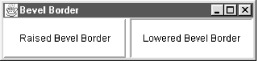
Notice how the
border creates the illusion of three dimensions. The bevel border
simulates a light source above and to the left of the object (this
light source location must be consistent for all 3D components in
order to be effective). The border is then drawn with four colors: an
outer and inner
highlight color and an outer and inner
shadow color. The highlight colors represent
the two surfaces of the bevel facing toward the light while the
shadow colors represent the surfaces facing away from the light.
Figure 13-5 shows how a bevel border uses the
highlight and shadow colors.
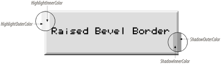
When the bevel is raised, the top and left sides of the border are
highlighted, and the bottom and right sides of the border are
shadowed. This presents the appearance of the surface protruding
above the background. When the bevel is lowered, the highlighted and
shadowed surfaces are reversed, and the border appears to sink into
the background. A bevel border is two pixels wide on all sides. The
inner color represents the inner pixels for the
border; the outer color represents the outer
pixels.
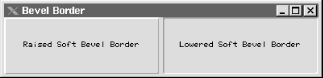
The beveled border in Swing has a subclass,
SoftBevelBorder, that can be used to simulate a
subtle raised or lowered edge around a component. In fact, the only
difference from the regular BevelBorder is that
the soft beveled edge is slightly thinner on two of its four sides
and provides for small rounded corners. Figure 13-6
shows a pair of soft bevel borders; if your eyes are really good, you
may be able to tell the difference between these and the plain bevel
borders.
13.3.1.1 Properties
Table 13-2 shows the properties of
BevelBorder and
SoftBevelBorder. The bevelType
property shows whether the border appears raised or lowered. The
borderOpaque property
is true by default for a bevel border and
false for a soft bevel border.
Table 13-2. BevelBorder and SoftBevelBorder properties
|
bevelType
|
int
|
·
|
|
|
BevelBorder.RAISED
|
|
borderOpaqueo
|
boolean
|
|
·
|
|
See text
|
|
highlightInnerColor1.3
|
Color
|
·
|
|
|
See Table 13-4
|
|
highlightOuterColor1.3
|
Color
|
·
|
|
|
See Table 13-4
|
|
shadowInnerColor1.3
|
Color
|
·
|
|
|
See Table 13-4
|
|
shadowOuterColor1.3
|
Color
|
·
|
|
|
See Table 13-4
|
|
1.3since 1.3,
ooverridden
|
13.3.1.2 Constants
The BevelBorder and
SoftBevelBorder classes define two constants used
to initialize the
bevelType property, as
shown in Table 13-3.
Table 13-3. BevelBorder and SoftBevelBorder constants
|
RAISED
|
int
|
Raised bevel border
|
|
LOWERED
|
int
|
Lowered bevel border
|
13.3.1.3 Default colors
If colors are not specified in the constructor, they are derived from
the component using the border, as shown in Table 13-4. In this table, background
refers to the component's background color.
Table 13-4. Default colors for bevel borders
|
highlightOuterColor
|
background.brighter( ).brighter( )
|
|
highlightInnerColor
|
background.brighter( )
|
|
shadowOuterColor
|
background.darker( ).darker( )
|
|
shadowInnerColor
|
background.darker( )
|
13.3.1.4 Constructors
- public BevelBorder(int bevelType)
- public BevelBorder(int bevelType, Color highlight, Color shadow)
- public BevelBorder(int bevelType, Color highlightOuter, Color highlightInner, Color shadowOuter, Color shadowInner)
-
These constructors can be used to set the initial property values of
the BevelBorder. The constructor is the only way
the colors of the bevel border can be set; there are no mutator
methods for the color variables.
- public SoftBevelBorder(int bevelType)
- public SoftBevelBorder(int bevelType, Color highlight, Color shadow)
- public SoftBevelBorder(int bevelType, Color highlightOuter, Color highlightInner, Color shadowOuter, Color shadowInner)
-
These constructors can be used to set the initial property values of
the SoftBevelBorder. The definitions are identical
to BevelBorder constructors.
In the constructors with two Color arguments, the
given colors set the
highlightInner
and
shadowOuter properties.
highlightOuter is set to
highlight.darker( ), and
shadowInner is set to shadow.brighter( ).
13.3.1.5 Methods
- public Insets getBorderInsets(Component c)
- public Insets getBorderInsets(Component c, Insets i)
-
Return an Insets object specifying an inset of two
pixels on each side for BevelBorder and three
pixels on each side for SoftBevelBorder. The
second version of this method modifies and returns the supplied
Insets object, i, allowing a
single instance to be reused for efficiency.
- public Color getHighlightInnerColor(Component c)
- public Color getHighlightOuterColor(Component c)
- public Color getShadowInnerColor(Component c)
- public Color getShadowOuterColor(Component c)
-
Retrieve various colors that would be used to draw the border if
attached to an arbitrary component; the colors are used as shown in
Figure 13-5.
- public void paintBorder(Component c, Graphics g, int x, int y, int width, int height)
-
Draw the beveled border within the graphics context of the
component.
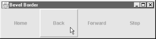
13.3.1.6 Changing borders on the fly
Here is a short program that creates four
labels. Each label draws a bevel
border around itself when the
mouse pointer enters the
component's region and erases it when the mouse
leaves the region. This kind of
"rollover" effect has become a
popular feature in some applications' toolbars.
Modifying the program to use soft bevel borders would be trivial.
//  BevelExample.java
//
import java.awt.*;
import java.awt.event.*;
import javax.swing.*;
import javax.swing.border.*;

public class BevelExample extends JPanel {

    BevelBorder bevel;
    EmptyBorder empty;
    JLabel label[] = new JLabel[4];

    public BevelExample( ) {
        super(true);
        setLayout(new GridLayout(1, 4));

        bevel = new BevelBorder(BevelBorder.RAISED);
        empty = new EmptyBorder(5, 5, 5, 5);

        label[0] = new JLabel("Home");
        label[1] = new JLabel("Back");
        label[2] = new JLabel("Forward");
        label[3] = new JLabel("Stop");

        for (int i = 0; i < label.length; i++) {
            label[i].setHorizontalAlignment(JLabel.CENTER);
            label[i].addMouseListener(new RolloverListener( ));
            label[i].setBorder(empty);
            add(label[i]);
        }
    }

    public static void main(String s[]) {
         JFrame frame = new JFrame("Bevel Border");
         frame.setDefaultCloseOperation(JFrame.EXIT_ON_CLOSE);
         frame.setSize(400, 100);
         frame.setContentPane(new BevelExample( ));
         frame.setVisible(true);
    }

    // Inner class to respond to mouse events for the "rollover" effect
    class RolloverListener extends MouseAdapter {
        public void mouseEntered(MouseEvent e) {
            ((JLabel)e.getComponent( )).setBorder(bevel);
            repaint( );
        }

        public void mouseExited(MouseEvent e) {
            ((JLabel)e.getComponent( )).setBorder(empty);
            repaint( );
        }

        public void mouseClicked(MouseEvent e) {
            String text = ((JLabel)e.getComponent( )).getText( );
            System.out.println("You clicked " + text + "!");
        }
    }
}
Figure 13-7 shows the results of our
example.
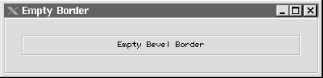
13.3.2 The Empty Border Class
The EmptyBorder class is used to place empty space around
a component. The size of the
space on each side is defined by the border's
insets, which are set in the constructor. Figure 13-8 shows an empty border with 20 pixels on all
sides surrounding a JLabel. (Note that we used two
other borders to denote the boundaries of the
EmptyBorder.)
13.3.2.1 Properties
Table 13-5 shows the properties of the
EmptyBorder class.
Table 13-5. EmptyBorder properties
|
borderInsets1.3
|
Insets
|
·
|
|
|
None (set in constructor)
|
|
borderOpaqueo
|
boolean
|
|
·
|
|
false
|
|
1.3since 1.3,
ooverridden
|
13.3.2.2 Constructors
- public EmptyBorder(int top, int left, int bottom, int right)
- public EmptyBorder(Insets insets)
-
Create an empty border with the given insets.
- public void paintBorder(Component c, Graphics g, int x, int y, int width, int height)
-
Since this is an empty border, this method does nothing.
13.3.2.3 Method
- public Insets getBorderInsets(Component c)
- public Insets getBorderInsets(Component c, Insets i)
-
Return the insets that would be used with the specified component.
The first version of this method returns an Insets
object with the insets specified in the constructor (this is the same
as the borderInsets property). The second version
of the method modifies and returns the supplied
Insets object i for efficiency,
reducing the number of throwaway objects created.
13.3.3 The EtchedBorder Class
An etched border is a single etching that
surrounds the target component. The etching consists of adjacent
lines of two colors, a highlight and a shadow, and can be raised or
lowered. Like bevel borders, etched borders render themselves by
simulating a light source above and to the left. The highlight is the
color of the etching that faces the light source while the shadow is
the color of the etching that faces away from the light source. An
etched border is shown in Figure 13-9.
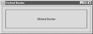
An etched border is very similar to a bevel border. By carefully
manipulating the colors, you can create an
EtchedBorder from a
BevelBorder.
13.3.3.1 Properties
The properties for the EtchedBorder class are
shown in Table 13-6. The
borderOpaque property always returns
true, indicating that this border paints over all
of its allocated pixels. The
etchType
tells whether the etch
appears raised or lowered. Finally, the
highlightColor and shadowColor
properties indicate the two colors used to simulate the etching. If
no values are given, brighter and darker variations of the background
color of the component are used for highlightColor
and shadowColor, respectively.
Table 13-6. EtchedBorder properties
|
borderOpaqueo
|
boolean
|
|
·
|
|
true
|
|
etchType
|
int
|
·
|
|
|
EtchedBorder.LOWERED
|
|
highlightColor1.3
|
Color
|
·
|
|
|
null
|
|
shadowColor1.3
|
Color
|
·
|
|
|
null
|
|
1.3since 1.3,
ooverridden
|
13.3.3.2 Constants
EtchedBorder contains two constants used to
initialize the etchType property, as shown in
Table 13-7.
Table 13-7. EtchedBorder constants
|
RAISED
|
int
|
A raised border
|
|
LOWERED
|
int
|
A lowered border
|
13.3.3.3 Constructors
- public EtchedBorder( )
-
Create a simple lowered etched border. The colors of the
border's highlight and shadow default to the
brighter( ) and darker( )
shades of the background color of any bordered component.
- public EtchedBorder(Color highlight, Color shadow)
-
Create a lowered etched border using the specified highlight and
shadow colors for the etching. There are no mutators
("set" methods) for the color
fields; they can be set only during construction.
- public EtchedBorder(int etchType)
-
Create a simple etched border of the etch type passed in. The colors
of the border's highlight and shadow default to the
brighter( ) and darker( )
shades of the background color of any bordered component.
- public EtchedBorder(int etchType, Color highlight, Color shadow)
-
Create an etched border of the type passed in using the specified
highlight and shadow colors for the etching. Note that there are no
mutators for any of the properties; they can be set only during
construction.
13.3.3.4 Miscellaneous
- public Insets getBorderInsets(Component c)
- public Insets getBorderInsets(Comonent c, Insets i)
-
Return an Insets object specifying an inset of
2 on each side. The second version of this method
modifies and returns the given Insets object,
i.
- public Color getHighlightColor(Component c)
- public Color getShadowColor(Component c)
-
Retrieve the colors that would be used to draw the shadowed and
highlighted parts of the border on the specified component.
- public void paintBorder(Component c, Graphics g, int x, int y, int width, int height)
-
Cause the border to paint itself with the graphics context of the
component.
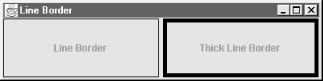
13.3.4 The LineBorder Class
The LineBorder class creates a border consisting of a
line of arbitrary thickness around the component. Unlike the beveled
or etched borders, the line is a single color and is not shaded.
Since SDK 1.3, you can specify that the border use (very subtly)
rounded corners. Figure 13-10 shows two different
line borders, each with a different thicknesses.
13.3.4.1 Properties
The properties for the LineBorder object are shown
in Table 13-8. The
borderOpaque
property always returns true, indicating that this
border paints over all of its allocated pixels. The others describe
the way it will be drawn; all are read-only and can be set only
during construction.
Table 13-8. LineBorder properties
|
borderOpaqueo
|
boolean
|
|
·
|
|
true
|
|
lineColor
|
Color
|
·
|
|
|
From constructor
|
|
roundedCorners
|
boolean
|
·
|
|
|
false
|
|
thickness
|
int
|
·
|
|
|
1
|
|
ooverridden
|
13.3.4.2 Constructors
- public LineBorder(Color color)
- public LineBorder(Color color, int thickness)
- public LineBorder(Color color, int thickness, boolean roundedCorners)
-
Create a lined border with a specific color and an optional thickness
and (since SDK 1.3) possibly rounded corners. The thickness defaults
to 1, and the corners to nonrounded.
13.3.4.3 Methods
- public Insets getBorderInsets(Component c)
- public Insets getBorderInsets(Component c, Insets i)
-
Return an Insets object; the inset on each side is
equal to the thickness of the line, as specified in the constructor.
The second version of this method modifies and returns the given
Insets object, i.
- public void paintBorder(Component c, Graphics g, int x, int y, int width, int height)
-
Cause the border to paint itself with the graphics context of the
component.
13.3.4.4 Miscellaneous
The LineBorder class contains two shortcut
methods
allowing you to reuse objects for certain commonly used kinds of
borders. These methods reduce garbage collection by returning the
same object each time they are called. (The ability to safely and
easily support this kind of shared object reuse is one of the
major advantages of writing immutable classes like
LineBorder.)
- public static Border
createBlackLineBorder( )
-
Return the equivalent of LineBorder(Color.black,
1).
- public static Border createGrayLineBorder( )
-
Return the equivalent of LineBorder(Color.gray, 1).
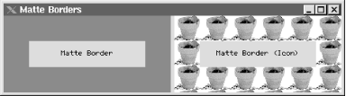
13.3.5 The MatteBorder Class
In art and photography, a
mat is often used to offset a picture from its
frame. In Swing, matte
borders perform the same function, separating a component from
everything else. A matte border in Swing can be either a solid color
or a repeated image icon. The color or icon fills the entire space
reserved by the border's insets.
With a MatteBorder, you have the choice of
constructing the object with either a Color or an
Icon. If you choose a color, the color flood-fills
the entire space reserved for the border. If you use an icon, the
icon tiles or wallpapers itself throughout the entire area of the
MatteBorder. Figure 13-11 shows
both kinds of MatteBorder.
13.3.5.1 Properties
MatteBorder extends the
EmptyBorder class. The
borderOpaque property can be either
true or false, depending on how
the border is used. If the MatteBorder is drawn
exclusively with a solid color, then the border is opaque, and the
property has a value of true. If the border is
used with an image, the image may contain transparency, and the
property has a value of false. (See Table 13-9.)
Table 13-9. MatteBorder properties
|
borderInsets1.3
|
Insets
|
·
|
|
|
None (set in constructor)
|
|
borderOpaqueo
|
boolean
|
|
·
|
|
None (depends on kind; see text)
|
|
1.3since 1.3,
ooverridden
|
 |
Be careful if you use an image
icon with a
MatteBorder without explicitly setting the insets.
The resulting border insets are the width and height of the icon
used, which (depending on how much space the layout manager gives)
could paint over part of your component.
|
|
13.3.5.2 Constructors
- public MatteBorder(Icon tileIcon)
-
Create a matte border by calculating the insets from the icon passed
in. The border's top and bottom height matches the
height of the icon, while the border's left and
right width matches the width of the icon.
- public MatteBorder(Insets borderInsets, Color matteColor)
- public MatteBorder(int top, int left, int bottom, int right, Color matteColor)
-
Create a matte border with the specified insets using the solid color
specified by matteColor.
- public MatteBorder(Insets borderInsets, Icon tileIcon)
- public MatteBorder(int top, int left, int bottom, int right, Icon tileIcon)
-
Create a matte border with the specified insets. Instead of using a
flood-filled color, however, the specified icon is wallpapered
throughout the border's space.
13.3.5.3 Methods
- public Insets getBorderInsets(Component c)
- public Insets getBorderInsets(Component c, Insets i)
-
Retrieve information about the component's insets
(the component isn't used; the value returned is the
same as that obtained through the borderInsets
property). The insets depend on how the border was constructed. If
the insets were specified explicitly in the constructor, those insets
are returned. If the border uses an icon and insets
weren't specified explicitly, the width of the icon
is used as the inset on the left and right sides, and the height of
the icon is used on the top and bottom. The second version of this
method modifies and returns the given Insets
object, i, to reduce the number of garbage objects
created.
- public void paintBorder(Component c, Graphics g, int x, int y, int width, int height)
-
Cause the border to paint itself with the graphics context of the
component.
13.3.5.4 Two kinds of matte borders
Here is a program that displays the two types of matte borders from
Figure 13-11.
//  MatteExample.java
//
import java.awt.*;
import javax.swing.*;
import javax.swing.border.*;

public class MatteExample extends JPanel {

    public MatteExample( ) {
        super(true);
        this.setLayout(new GridLayout(1, 2, 5, 5));

        JLabel label1 = new JLabel("Matte Border");
        JLabel label2 = new JLabel("Matte Border (Icon)");

        label1.setHorizontalAlignment(JLabel.CENTER);
        label2.setHorizontalAlignment(JLabel.CENTER);

        Icon icon = new ImageIcon("plant.gif");
        MatteBorder matte = new MatteBorder(35, 35, 35, 35, Color.blue);
        MatteBorder matteicon = new MatteBorder(35, 35, 35, 35, icon);
        label1.setBorder(matte);
        label2.setBorder(matteicon);

        add(label1);
        add(label2);
    }

    public static void main(String s[]) {
         JFrame frame = new JFrame("Matte Borders");
         frame.setDefaultCloseOperation(JFrame.EXIT_ON_CLOSE);
         frame.setSize(500, 200);
         frame.setContentPane(new MatteExample( ));
         frame.setVisible(true);
    }
}
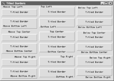
13.3.6 The TitledBorder Class
The TitledBorder class takes an arbitrary border and adds
a descriptive string to it. This title string can be placed in one of
six different positions around the component and can be set to appear
above, below, or overlaid on the border. In addition, you can specify
the font and color of the title string. Figure 13-12
enumerates all of the explicit title positions and justifications
available.
 |
Since SDK 1.3, there are also two logical positions,
LEADING and TRAILING, which
position the title relative to the direction in which text flows
under the current locale. For better internationalization support,
use LEADING and TRAILING rather
than the explicit LEFT or RIGHT
positions.
|
|
You can use any style of border in conjunction with a
TitledBorder by setting the
TitledBorder's own
border property. For example, the borders in Figure 13-12 are used in conjunction with a
BevelBorder. The default border style, however, is
an EtchedBorder. A titled, etched border (with the
title at the top leading corner) has a strong tradition of being used
in many applications to group a set of related user-interface
elements visually inside of a larger window.
13.3.6.1 Properties
The properties for the TitledBorder class are
given in Table 13-10. The
border property contains the border that is
being titled. It can be any border that implements the
Border interface. The read-only
borderOpaque property always returns
false; the titled border does not color all of its
pixels. The title property holds the string that is
displayed with this border.
titleColor
is the string's
color, titleFont represents its font, size, and
style. titleJustification and
titlePosition tell where the title appears in
relation to the component and the border. See Table 13-11 and Table 13-12 for their
values.
Table 13-10. TitledBorder properties
|
border
|
Border
|
·
|
|
·
|
From L&F
|
|
borderOpaqueo
|
boolean
|
|
·
|
|
false
|
|
title
|
String
|
·
|
|
·
|
""
|
|
titleColor
|
Color
|
·
|
|
·
|
From L&F
|
|
titleFont
|
Font
|
·
|
|
·
|
From L&F
|
|
titleJustification
|
int
|
·
|
|
·
|
LEADING1.3
|
|
titlePosition
|
int
|
·
|
|
·
|
TOP
|
|
1.3since 1.3, ooverridden
|
Table 13-11. Justification constants
|
DEFAULT_JUSTIFICATION
|
int
|
Use the default justification, which is LEADING.
|
|
LEFT
|
int
|
Place the title string on the left side of the border.
|
|
CENTER
|
int
|
Place the title string in the center of the border.
|
|
RIGHT
|
int
|
Place the title string on the right side of the border
|
|
LEADING1.3
|
int
|
Locale-sensitive positioning to the left for text that is oriented
left-to-right, to the right if right-to-left.
|
|
TRAILING1.3
|
int
|
Locale-sensitive to the right for text that is oriented
left-to-right, to the left if right-to-left.
|
|
1.3since 1.3
|
Table 13-12. Position constants
|
DEFAULT_POSITION
|
int
|
Place the text in the default position, TOP.
|
|
ABOVE_TOP
|
int
|
Place the text above the top line of the border.
|
|
TOP
|
int
|
Place the text on the top line of the border.
|
|
BELOW_TOP
|
int
|
Place the text below the top line of the border.
|
|
ABOVE_BOTTOM
|
int
|
Place the text above the bottom line of the border.
|
|
BOTTOM
|
int
|
Place the text on the bottom line of the border.
|
|
BELOW_BOTTOM
|
int
|
Place the text below the bottom line of the border.
|
13.3.6.2 Constructors
- public TitledBorder(String title)
- public TitledBorder(Border border)
- public TitledBorder(Border border, String title)
- public TitledBorder(Border border, String title, int titleJustification, int titlePosition)
- public TitledBorder(Border border, String title, int titleJustification, int titlePosition, Font titleFont)
- public TitledBorder(Border border, String title, int titleJustification, int titlePosition, Font titleFont, Color titleColor)
-
Create a TitledBorder instance with the specified
properties. Any border that implements the Border
interface can be used for the border property. The
justification and position constants are enumerated in Tables Table 13-11 and Table 13-12. Default
values for omitted properties are shown in Table 13-10.
13.3.6.3 Miscellaneous
- public Insets getBorderInsets(Component c)
- public Insets getBorderInsets(Component c, Insets i)
-
Return an Insets object that describes the insets
being used by the titled border; the insets depend on both the
underlying border and the font and position of the
border's title. The second version of this method
tries to reduce garbage creation by modifying and returning the given
Insets object, i, but it
can't perform this optimization if the underlying
border doesn't extend
AbstractBorder (and thus may lack a corresponding
method).
- public void paintBorder(Component c, Graphics g, int x, int y, int width, int height)
-
Cause the border to paint itself with the graphics context of the
component.
- public Dimension getMinimumSize(Component c)
-
Return the minimum size of this border, including the border and text.
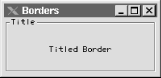
13.3.6.4 Using a titled border
Here is a short program that creates the image displayed in Figure 13-13:
//  TitledExample.java
//
import java.awt.*;
import javax.swing.*;
import javax.swing.border.*;

public class TitledExample extends JPanel {

    public TitledExample( ) {
        super(true);

        this.setLayout(new GridLayout(1, 1, 5, 5));

        JLabel label = new JLabel("Titled Border");
        label.setHorizontalAlignment(JLabel.CENTER);

        TitledBorder titled = new TitledBorder("Title");
        label.setBorder(titled);

        add(label);
    }

    public static void main(String s[]) {
         JFrame frame = new JFrame("Borders");
         frame.setDefaultCloseOperation(JFrame.EXIT_ON_CLOSE);
         frame.setSize(200, 100);
         frame.setContentPane(new TitledExample( ));
         frame.setVisible(true);
    }
}
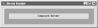
13.3.7 The CompoundBorder Class
You can combine two borders to create
more elaborate displays with the CompoundBorder
class. The insets of both borders are added together to form the
insets of the resulting compound border object. The component renders
the outside border first, followed by the inside border. You can
compound borders recursively so that any number of borders can be
embedded inside of a CompoundBorder object:
CompoundBorder comp = new CompoundBorder(new CompoundBorder(new EtchedBorder( ),
                                         new EmptyBorder(10, 10, 10, 10)),
                      new MatteBorder(20, 20, 20, 20, Color.red));
The preceding code yields the border in Figure 13-14.
13.3.7.1 Properties
Table 13-13 lists the properties of the
CompoundBorder class. The
insideBorder
and
outsideBorder properties hold the borders that are
combined. If both of the borders in the compound border are opaque,
the borderOpaque property is
true. Otherwise, the property is
false.
Table 13-13. CompoundBorder properties
|
borderOpaqueo
|
boolean
|
|
·
|
|
See text
|
|
insideBorder
|
Border
|
·
|
|
|
null
|
|
outsideBorder
|
Border
|
·
|
|
|
null
|
|
ooverridden
|
13.3.7.2 Constructors
- public CompoundBorder( )
-
Initialize an empty compound border with no outside or inside border.
Because there are no mutators
("set" methods) for any border
property, you will probably never invoke this constructor.
- public CompoundBorder(Border outsideBorder, Border insideBorder)
-
Create a compound border object with the specified inside and outside
borders.
13.3.7.3 Miscellaneous
- public Insets getBorderInsets(Component c)
- public Insets getBorderInsets(Component c, Insets i)
-
Return an Insets object describing the insets used
by the compound border; the inset on each side is the sum of the
insets of the borders being combined in this compound border. The
second version of this method modifies and returns the given
Insets object, i, to help
reduce the number of temporary garbage objects created.
- public void paintBorder(Component c, Graphics g, int x, int y, int width, int height)
-
Cause the border to paint itself with the graphics context of the
component.
13.3.8 The BorderFactory Class
The BorderFactory class
(which is in the javax.swing package) allows you
to call various static methods to create borders. Instead of
declaring new instances for each border, the factory class attempts
to reuse previously defined (cached) borders, thus saving memory.
It's a good idea to get in the habit of using this
factory if you create a lot of borders in your application.
Currently, only a few borders are actually cached. But in future
releases, additional border caching may be added to this class. The
fact that most border classes are immutable
(i.e., they contain no mutator methods that would allow them to be
changed) is an excellent design choice that enables this kind of
instance sharing safely and easily even in a multithreaded
environment like Java.
13.3.8.1 Methods
- public static Border createBevelBorder(int bevelType)
-
Create a BevelBorder of the specified type (either
raised or lowered). This method returns a cached border rather than
creating a new one.
- public static Border createBevelBorder(int bevelType, Color highlight, Color shadow)
-
Create a BevelBorder of the specified type (either
raised or lowered), with the appropriate highlight and shadow colors.
- public static Border createBevelBorder(int bevelType, Color highlightOuter,
- Color highlightInner, Color shadowOuter, Color shadowInner)
-
Create a BevelBorder of the specified type (either
raised or lowered), with the appropriate highlight and shadow colors.
- public static Border createEmptyBorder( )
-
Create an EmptyBorder. This method returns a
cached border rather than creating a new one.
- public static Border createEmptyBorder(int top, int left, int bottom, int right)
-
Create an EmptyBorder with the specified size.
- public static Border createEtchedBorder( )
-
Create a default EtchedBorder. This method returns
a cached border rather than creating a new one.
- public static Border createEtchedBorder(Color highlight, Color shadow)
-
Create an EtchedBorder with the appropriate
highlight and shadow colors.
- public static Border createEtchedBorder(int bevelType)
-
Since SDK 1.3, this method allows you to create nonlowered etched
borders. Returns a cached border rather than creating a new one each
time.
- public static Border createEtchedBorder(int bevelType, Color highlight, Color shadow)
-
Since SDK 1.3, this method allows you to create nonlowered etched
borders using particular colors.
- public static Border createLineBorder(Color color)
-
Create a LineBorder with the specified color.
- public static Border createLineBorder(Color color, int thickness)
-
Create a LineBorder with the specified color and
thickness.
- public static Border createLoweredBevelBorder( )
-
Create a lowered BevelBorder. This method returns
a cached border rather than creating a new one.
- public static Border createRaisedBevelBorder( )
-
Create a raised BevelBorder. This method returns a
cached border rather than creating a new one.
- public static CompoundBorder createCompoundBorder( )
-
Create an empty CompoundBorder.
- public static CompoundBorder createCompoundBorder(Border outsideBorder, Border insideBorder)
-
Create a CompoundBorder by combining the two
borders passed in.
- public static MatteBorder createMatteBorder(int top, int left, int bottom, int right, Color color)
-
Create a MatteBorder with the specified size and
color.
- public static MatteBorder createMatteBorder(int top, int left, int bottom, int right, Icon titleIcon)
-
Create a MatteBorder with the specified size,
tile-filling it with instances of the specified icon
titleIcon.
- public static TitledBorder createTitledBorder(Border border)
-
Create a TitledBorder from
border.
- public static TitledBorder createTitledBorder(Border border, String title)
-
Create a TitledBorder from
border. The border's title is the
title string passed in, positioned at the upper
left of the border.
- public static TitledBorder createTitledBorder(Border border, String title, int titleJustification, int titlePosition)
-
Create a TitledBorder from the
Border passed in. The border's
title, justification, and position are also passed in.
- public static TitledBorder createTitledBorder(Border border, String title, int titleJustification, int titlePosition, Font titleFont)
-
Create a TitledBorder from the
Border passed in. The border's
title, justification, position, and font are all passed in.
- public static TitledBorder createTitledBorder(Border border, String title, int titleJustification, int titlePosition, Font titleFont, Color titleColor)
-
Create a TitledBorder from the
Border passed in. The border's
title is the title string passed in. The
justification, position, font, and color of the border are also
dictated by the variables passed in.
- public static TitledBorder createTitledBorder(String title)
-
Create a TitledBorder with the given
title.

|