| I l@ve RuBoard |
|
14.8 ToolbarsToolbars are another approach to providing access to commonly used application features. They are more likely than menus to use graphical representations of commands. Because they remain on-screen at all times (unlike menus, which drop down only when activated) they can provide a useful "dashboard" for indicating the current state of the application. On the other hand, they take up more room than menu bars, so it's good to let the user decide whether they should be visible at all. Toolbars have the ability to "tear" themselves from their location within a frame and embed their components in a moveable standalone window. This gives the user the freedom to drag the toolbar anywhere on the screen. In addition, toolbars can "dock" in locations where the layout manager can support them. 14.8.1 The JToolBar ClassLike the menu bar, the JToolBar class is a container for various components. You can add any component to the toolbar, including buttons, combo boxes, and even additional menus. Like menus, the toolbar is easiest to work with when paired with Action objects. When a component is added to the toolbar, it is assigned an integer index that determines its display order from left to right. While there is no restriction on the type of component that can be added, the toolbar generally looks best if it uses components that are the same vertical height. Note that toolbars have a default border installed by the L&F. If you don't like the default, you can override the border with one of your own using the setBorder( ) method. Alternatively, you can deactivate the drawing of the border by setting the borderPainted property to false. JToolBar has its own separator that inserts a blank space on the toolbar; you can use the addSeparator( ) method to access this separator. Separators are useful if you want to add space between groups of related toolbar components. The separator for toolbars is actually an inner class. Be sure not to confuse this separator with the JSeparator class. Figure 14-20 shows the class diagram for the JToolBar component. Figure 14-20. JToolBar class diagram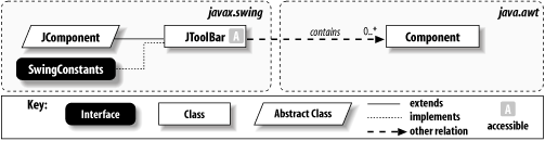 14.8.1.1 Floating toolbarsAlthough toolbars can be easily positioned in Swing containers, they do not have to stay there. Instead, you can "float" the toolbar by holding the mouse button down while the cursor is over an empty section of the toolbar (that is, not over any of its components) and dragging. This places the toolbar in a moveable child window; you can position it anywhere in the viewing area. Toolbars can then reattach themselves to specific locations, or hotspots, within the frame. Letting go of the toolbar while dragging it over a hotspot anchors the toolbar back into the container. Figure 14-21 is an example of a floating toolbar. Figure 14-21. A floating toolbar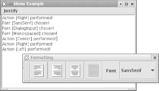 It is best to place a toolbar in a container that supports the BorderLayout. If you intend to make the toolbar floatable, place it along either the north, south, east, or west side of the container, and leave the remaining sides open. This allows the toolbar to define anchor spots when it is being dragged and ensures that the resulting layout is not ambiguous. If you want to disable floating, you can reset the floatable property to false: JToolBar toolBar = new JToolBar( ); toolBar.setFloatable(false); 14.8.1.2 PropertiesThe properties of the JToolBar class are shown in Table 14-12. The borderPainted property defines whether the toolbar should paint its border. The JToolBar constructor resets the layout manager of the component to a BoxLayout along the x axis (this becomes a y-axis BoxLayout if the orientation is VERTICAL), which it uses to place any child components. The margin property defines the insets that appear between the toolbar's edges and its components. The floatable property defines whether the toolbar can be separated from the container and "floated" in a standalone window. You can use the indexed componentAtIndex property to access any of the components on the toolbar. The orientation property determines whether the toolbar is horizontal or vertical. Its value must be either HORIZONTAL or VERTICAL (constants defined in SwingConstants). Attempting to set orientation to some other value throws an IllegalArgumentException. Finally, starting with SDK 1.4, rollover can be set to cause the toolbar's button borders to be drawn only when the mouse is hovering over them, a style of interface popularized by dynamic web sites. Not all L&Fs honor a true value for rollover.
14.8.1.3 EventJToolbar generates a PropertyChangeEvent when any of its bound properties are changed. 14.8.1.4 Constructor
14.8.1.5 Adding actions
14.8.1.6 Miscellaneous
14.8.2 Creating a ToolbarThe following example adds a toolbar to the JMenu example and provides a glimpse of the true power of using Action objects for building a user interface. To add some interesting complexity, we also allow the user to choose a font from a combo box, showing that you can use other kinds of components in a toolbar. Note that we add the combo box and a JLabel for it as separate components and that the combo box uses its own actionPerformed( ) method. // ToolBarExample.java
//
import java.awt.*;
import java.awt.event.*;
import javax.swing.*;
import javax.swing.border.*;
import javax.swing.event.*;
public class ToolBarExample extends JPanel {
public JTextPane pane;
public JMenuBar menuBar;
public JToolBar toolBar;
String fonts[] = {"Serif","SansSerif","Monospaced","Dialog","DialogInput"};
public ToolBarExample( ) {
menuBar = new JMenuBar( );
// Create a set of actions to use in both the menu and toolbar.
DemoAction leftJustifyAction = new DemoAction("Left",
new ImageIcon("left.gif"), "Left justify text", 'L');
DemoAction rightJustifyAction = new DemoAction("Right",
new ImageIcon("right.gif"), "Right justify text", 'R');
DemoAction centerJustifyAction = new DemoAction("Center",
new ImageIcon("center.gif"), "Center justify text", 'M');
DemoAction fullJustifyAction = new DemoAction("Full",
new ImageIcon("full.gif"), "Full justify text", 'F');
JMenu formatMenu = new JMenu("Justify");
formatMenu.add(leftJustifyAction);
formatMenu.add(rightJustifyAction);
formatMenu.add(centerJustifyAction);
formatMenu.add(fullJustifyAction);
menuBar.add(formatMenu);
toolBar = new JToolBar("Formatting");
toolBar.add(leftJustifyAction);
toolBar.add(rightJustifyAction);
toolBar.add(centerJustifyAction);
toolBar.add(fullJustifyAction);
toolBar.addSeparator( );
JLabel label = new JLabel("Font");
toolBar.add(label);
toolBar.addSeparator( );
JComboBox combo = new JComboBox(fonts);
combo.addActionListener(new ActionListener( ) {
public void actionPerformed(ActionEvent e) {
try { pane.getStyledDocument( ).insertString(0,
"Font [" + ((JComboBox)e.getSource( )).getSelectedItem( ) +
"] chosen!\n", null);
} catch (Exception ex) { ex.printStackTrace( ); }
}
});
toolBar.add(combo);
// Disable one of the Actions.
fullJustifyAction.setEnabled(false);
}
public static void main(String s[]) {
ToolBarExample example = new ToolBarExample( );
example.pane = new JTextPane( );
example.pane.setPreferredSize(new Dimension(250, 250));
example.pane.setBorder(new BevelBorder(BevelBorder.LOWERED));
example.toolBar.setMaximumSize(example.toolBar.getSize( ));
JFrame frame = new JFrame("Menu Example");
frame.setDefaultCloseOperation(JFrame.EXIT_ON_CLOSE);
frame.setJMenuBar(example.menuBar);
frame.getContentPane( ).add(example.toolBar, BorderLayout.NORTH);
frame.getContentPane( ).add(example.pane, BorderLayout.CENTER);
frame.pack( );
frame.setVisible(true);
}
class DemoAction extends AbstractAction {
public DemoAction(String text, Icon icon, String description,
char accelerator) {
super(text, icon);
putValue(ACCELERATOR_KEY, KeyStroke.getKeyStroke(accelerator,
Toolkit.getDefaultToolkit( ).getMenuShortcutKeyMask( )));
putValue(SHORT_DESCRIPTION, description);
}
public void actionPerformed(ActionEvent e) {
try { pane.getStyledDocument( ).insertString(0,
"Action [" + getValue(NAME) + "] performed!\n", null);
} catch (Exception ex) { ex.printStackTrace( ); }
}
}
}
Note the efficiency we've achieved: by creating a single set of Actions to represent our justification modes, we can create a corresponding menu entry or toolbar button in a single line of code. Each has the appropriate label and/or icon, accelerator key (for menus), and tooltip. Try holding your mouse over the buttons to see the tooltip. Also notice that by disabling the Full justify action we automatically disabled both the corresponding menu item and toolbar button. When an action is disabled, all the associated components are notified of the property change. In our program, both the menu item and the toolbar button for full justification are grayed, as shown in Figure 14-22. Figure 14-22. Disabling actions automatically grays the toolbar and menu representations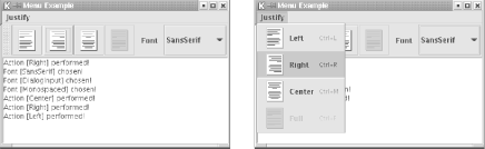 To see the toolbar float, click on the textured area at the left edge and drag it outside the window. You can also drag it to any edge of the frame to anchor it at that position. A JToolBar is a regular Swing component, so you can use more than one in an application. If you do so, and you wish to make the toolbars floatable, it is best to place each toolbar in a concentric BorderLayout container, leaving the other three sides unpopulated. This ensures that the toolbars maintain their respective positions if they are both dragged to a new side. |
| I l@ve RuBoard |
|