| I l@ve RuBoard |
|
26.7 Creation of a Custom Look-and-FeelEverything we've covered in this chapter up to this point has been useful background information for the ultimate application customization strategy: creating your own L&F. As you might guess, this is not something you'll do in an afternoon, nor is it usually something you should consider doing at all. However, thanks to the L&F framework, it's not as difficult as you might think. In a few instances, it actually makes sense, such as when you're developing a game. You'll likely find that the most difficult part is coming up with a graphical design for each component. There are basically three different strategies for creating a new L&F:
The first option gives you complete control over how everything works. It also requires a lot of effort. Unless you are implementing an L&F that is fundamentally different from the traditional desktop L&Fs, or you have some strong desire to implement your own L&F framework from scratch, we strongly recommend that you do not use this approach. The next option is the most logical if you want to create a completely new L&F. This is the approach we'll focus on in this section. The BasicLookAndFeel has been designed as an abstract framework for creating new L&Fs. Each of the Swing L&Fs extends Basic. The beauty of using this approach is that the majority of the programming logic is handled by the framework—all you really have to worry about is how the different components should look. The third option makes sense if you want to use an existing L&F, but just want to make a few tweaks to certain components. If you go with this approach, you need to be careful not to do things that confuse your users. Remember, people expect existing L&Fs to behave in certain familiar ways. 26.7.1 The PlainLookAndFeelWe'll discuss the process of creating a custom L&F by way of example. In this section, we'll define bits and pieces of an L&F called PlainLookAndFeel. The goal of this L&F is to be as simple as possible. We won't be doing anything fancy with colors, shading, or painting—this book is long enough without filling pages with fancy paint( ) implementations. Instead, we'll focus on how to create an L&F. All of our painting is done in black, white, and gray, and we use simple, single-width lines. It won't be pretty, but we hope it is educational. 26.7.2 Creating the LookAndFeel ClassThe logical first step in the implementation of a custom L&F is the creation of the LookAndFeel class itself. As we've said, the BasicLookAndFeel serves as a nice starting point. At a minimum, you'll need to implement the five abstract methods defined in the LookAndFeel base class (none of which is implemented in BasicLookAndFeel). Here's a look at the beginnings of our custom L&F class: // PlainLookAndFeel.java
//
package plain;
import java.awt.*;
import javax.swing.*;
import javax.swing.border.*;
import javax.swing.plaf.*;
import javax.swing.plaf.basic.*;
public class PlainLookAndFeel extends BasicLookAndFeel {
public String getDescription( ) { return "The Plain Look and Feel"; }
public String getID( ) { return "Plain"; }
public String getName( ) { return "Plain"; }
public boolean isNativeLookAndFeel( ) { return false; }
public boolean isSupportedLookAndFeel( ) { return true; }
// . . .
}
At this point, we have an L&F that actually compiles. Let's go a little further and make it useful. The next major step is to define the defaults for the L&F. This is similar to what we did earlier when we defined a few custom resources for an application. The difference is that now we are defining a complete set of resources for an entirely new L&F that can be used across many applications. The installation of defaults is handled by getDefaults( ), which has been broken down into three additional methods in BasicLookAndFeel. BasicLookAndFeel.getDefaults( ) creates a UIDefaults table and calls the following three methods (in this order):
Let's look at these three steps in detail. 26.7.2.1 Defining class defaultsDefining class defaults is the process of enumerating the names of the classes your L&F uses for each of the UI delegates. One nice feature of the BasicLookAndFeel is that it defines concrete implementations of all of the UI-delegate classes. One big benefit is that you can test your new L&F as you're creating it, without having to specify every single delegate class. Instead, just define the ones you want to test and use the basic implementations for the others. Those that you define (since they're stored in a simple Hashtable) override any values previously defined by BasicLookAndFeel. A typical implementation of this method looks something like this: protected void initClassDefaults(UIDefaults table) {
super.initClassDefaults(table); // Install the "basic" delegates.
String plainPkg = "plain.";
Object[] classes = {
"ProgressBarUI", plainPkg + "PlainProgressBarUI",
"SliderUI", plainPkg + "PlainSliderUI",
"TreeUI", plainPkg + "PlainTreeUI",
// . . .
};
table.putDefaults(classes);
}
The first line calls the BasicLookAndFeel implementation, which installs each of the basic UI delegates. Next, we create a string containing the package name for our L&F classes. This is used in constructing the class names of each of our UI delegates. We then create an array of UIClassID to UI-delegate class name mappings. The items in this array should alternate between class IDs[10] and class names. Include such a mapping for each UI delegate your L&F implements.
26.7.2.2 Defining look-and-feel colorsThe next set of defaults typically defined are the color resources used by the L&F. You have a lot of flexibility in handling colors. As we saw earlier in the chapter, the Metal L&F defines all colors in terms of a color "theme," allowing the colors used by the L&F to be easily customized. This feature is specific to Metal, but you can implement a similar feature in your own L&F. Colors are typically defined according to the colors specified in the java.awt.SystemColor class. These are the colors used by the BasicLookAndFeel, so if you are going to delegate any of the painting routines to Basic, it's important to define values for the system colors. Even if you are going to handle every bit of painting in your custom L&F, it's still a good idea, though it is not required, to use the familiar color names. BasicLookAndFeel adds another protected method called loadSystemColors( ). For non-native L&Fs, this simply maps an array of name/color value pairs into resource keys and ColorUIResource values. For example, a pair of entries in the array might be: "control", "#FFFFFF" This would result in a resource called "control" being added, with a value of the color white.
Using loadSystemColors( ) allows you to define the color values for your L&F by creating an array of key/value pairs, like the pair we just looked at. This array is then passed to loadSystemColors( ), along with the UIDefaults table. Here's a sample implementation of initSystemColorDefaults( ): protected void initSystemColorDefaults(UIDefaults table) {
String[] colors = {
"desktop", "#C0C0C0",
"activeCaption", "#FFFFFF",
"activeCaptionText", "#000000",
"activeCaptionBorder", "#000000"
// More of the same
};
loadSystemColors(table, colors, false);
}
Table 26-11 shows the 26 color keys used by SystemColor and BasicLookAndFeel.
26.7.2.3 Defining component defaultsThe last method called by BasicLookAndFeel.getDefaults( ) is initComponentDefaults( ). This is where you define all of the colors, icons, borders, and other resources used by each of the individual component delegates. The BasicLookAndFeel implementation of this method defines over 300 different resource values for 40 delegate classes. We've cataloged these resources, along with the type of value expected for each, in Appendix A. The good news is that you don't have to redefine all 300+ resource values in your custom L&F, though you certainly can. Many of the resources are colors and are defined in terms of the system colors we've already defined. For example, the Button.background resource defaults to the value defined for "control" while Button.foreground defaults to "controlText". As long as you've defined values for the system colors and you're happy with the system colors defined by the BasicLookAndFeel, you can get by with little or no changes to the component-level color resources. The amount of customization done in this method is really up to you. If you like the resource choices made by the BasicLookAndFeel, use them. If you want your own custom defaults, you can change them. The Swing L&Fs follow a few useful steps that make the implementation of initComponentDefaults( ) easier to understand:
26.7.3 Defining an Icon FactoryThis is not a required step, but it can prove useful. The Swing L&Fs group the definitions of various dynamic icons into an icon factory class. This class serves as a holder of singleton instances of the various dynamic icons used by the L&F and contains the inner classes that actually define the icons. Which icons, if any, you define in an icon factory is up to you. The Metal L&F uses its icon factory to draw all of its icons, except those used by JOptionPane. This allows Metal to change the color of its icons based on the current color theme, a task not easily achieved if the icons are loaded from GIF files. For our purposes, we concentrate on defining dynamic icons. The PlainLookAndFeel uses GIFs for all of the static icons. The easiest way to understand how to implement a dynamic icon is to look at a simple example. Here's a trimmed-down version of our PlainIconFactory class, showing how we implemented the radio button icon: // PlainIconFactory.java
//
package plain;
import java.awt.*;
import javax.swing.*;
import javax.swing.plaf.*;
import java.io.Serializable;
public class PlainIconFactory {
private static Icon radioButtonIcon;
private static Icon checkBoxIcon; // Implemention trimmed from example
// Provide access to the single RadioButtonIcon instance.
public static Icon getRadioButtonIcon( ) {
if (radioButtonIcon == null) {
radioButtonIcon = new RadioButtonIcon( );
}
return radioButtonIcon;
}
// An icon for rendering the default radio button icon
private static class RadioButtonIcon implements Icon, UIResource, Serializable
{
private static final int size = 15;
public int getIconWidth( ) { return size; }
public int getIconHeight( ) { return size; }
public void paintIcon(Component c, Graphics g, int x, int y) {
// Get the button and model containing the state we are supposed to show.
AbstractButton b = (AbstractButton)c;
ButtonModel model = b.getModel( );
// If the button is being pressed (and armed), change the BG color.
// (NOTE: could also do something different if the button is disabled)
if (model.isPressed( ) && model.isArmed( )) {
g.setColor(UIManager.getColor("RadioButton.pressed"));
g.fillOval(x, y, size-1, size-1);
}
// Draw an outer circle.
g.setColor(UIManager.getColor("RadioButton.foreground"));
g.drawOval(x, y, size-1, size-1);
// Fill a small circle inside if the button is selected.
if (model.isSelected( )) {
g.fillOval(x+4, y+4, size-8, size-8);
}
}
}
}
We provide a static getRadioButtonIcon( ) method that creates the icon the first time it's called. On subsequent calls, the single instance is returned immediately. We'll do the same thing for each dynamic icon we define. Next, we have the RadioButtonIcon inner class. Recall from Chapter 4 that there are three methods involved in implementing the Icon interface (the other interfaces, UIResource and Serializable, have no methods). Our implementations of getIconWidth( ) and getIconHeight( ) are simple; they just return a constant size. The interesting code is in paintIcon( ). In this method, what we paint depends on the state of the button's model. In our implementation, we do two checks. First, we check to see if the button is being pressed. If so (and if the button is armed, meaning that the mouse pointer is still over the button), we paint a special background color. Then we paint a solid outer circle and perform a second check to see if the button is selected. If it is, we paint a solid circle inside the outer circle. One thing to note here is that we chose to define a custom resource called RadioButton.pressed. Since there is no standard policy for showing that a button is pressed, we use this resource to define the background for our pressed button. The really interesting thing about this new icon class is that for many L&Fs, defining this icon is all you need to do to for the delegate that uses it. In PlainLookAndFeel, we don't even define a PlainRadioButtonUI class at all. Instead, we just create a RadioButtonIcon and set it as the icon using the resource "RadioButton.icon". Figure 26-13 shows some RadioButtons using the PlainLookAndFeel. The first button is selected, the second is selected and is being held down, and the third is unselected. Figure 26-13. PlainIconFactory.RadioButtonIcon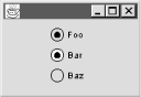 26.7.4 Defining Custom BordersCertain Swing components are typically rendered with some type of border around them. The javax.swing.border package defines a number of static borders that you can use. However, it's often desirable to create your own custom borders as part of your L&F. Also, certain borders (just like certain icons) should be painted differently depending on the state of the object they are being painted around. The Swing L&Fs define custom borders in a class called <L&F name>Borders. Many of the inner classes defined in BasicBorders may be useful when defining your own L&F. These are the borders used by default by the BasicLookAndFeel. They include the following inner classes:
It's probably not too important to understand the details of most of these inner classes. The important thing to know is that these are the borders installed for certain components by the BasicLookAndFeel. One of these inner classes, MarginBorder, does deserve special mention. This class defines a border that has no appearance, but takes up space. It's used with components that define a margin property, specifically AbstractButton, JToolBar, and JTextComponent. When defining borders for these components, it's important to create a CompoundBorder that includes an instance of BasicBorders.MarginBorder. If you don't do this, your L&F ignores the component's margin property, a potentially confusing problem for developers using your L&F. Here's an example from PlainLookAndFeel in which we use a MarginBorder to define the border that we'll use for our JButtons: Border marginBorder = new BasicBorders.MarginBorder( ); Object buttonBorder = new BorderUIResource.CompoundBorderUIResource( new PlainBorders.ButtonBorder( ), marginBorder); Note that the MarginBorder constructor takes no arguments. It simply checks the component's margin property in its paintBorder( ) method. Using a MarginBorder with a component that has no margin property simply results in a border with insets of (0,0,0,0). This example brings us back to the idea of creating a PlainBorders class that defines a set of borders for our L&F. Keep in mind that you don't have to do this. You're free to use the default borders provided by Basic, or even the simple borders defined by the swing.border package. Here's the PlainBorders class in which we define a single inner class for handling button borders: // PlainBorders.java
//
package plain;
import java.awt.*;
import javax.swing.*;
import javax.swing.border.*;
import javax.swing.plaf.*;
public class PlainBorders {
// An inner class for JButton borders
public static class ButtonBorder extends AbstractBorder implements UIResource
{
private Border raised; // Use this one by default.
private Border lowered; // Use this one when pressed.
// Create the border.
public ButtonBorder( ) {
raised = BorderFactory.createRaisedBevelBorder( );
lowered = BorderFactory.createLoweredBevelBorder( );
}
// Define the insets (in terms of one of the others).
public Insets getBorderInsets(Component c) {
return raised.getBorderInsets(c);
}
// Paint the border according to the current state.
public void paintBorder(Component c, Graphics g, int x, int y,
int width, int height) {
AbstractButton b = (AbstractButton)c;
ButtonModel model = b.getModel( );
if (model.isPressed( ) && model.isArmed( )) {
lowered.paintBorder(c, g, x, y, width, height);
}
else {
raised.paintBorder(c, g, x, y, width, height);
}
}
}
}
For the sake of providing a very simple example, we've implemented our ButtonBorder class using two other existing borders. Which of these borders is actually painted by our border is determined by the state of the button model. 26.7.5 The BasicGraphicsUtils ClassThere's one more class from the Basic L&F worth knowing something about. BasicGraphicsUtils defines a number of static utility methods that might be useful when creating your own L&F. 26.7.5.1 Methods
26.7.6 Creating the Individual UI DelegatesThe key step in developing an L&F is creating a set of UI delegate classes for the various Swing components that can't be sufficiently customized just by setting resource values or defining custom borders and icons. Unfortunately, a description of the methods involved in each individual UI delegate is beyond the scope of this book (we're starting to fear that no one will be able to lift it as it is!). Still, we don't want to leave you in the dark after coming so far, so we'll take a detailed look at a single example. For the rest of the chapter, we focus on the creation of the PlainSliderUI , but many of the steps along the way apply to other delegates as well. 26.7.6.1 Define a constructorConstructors for UI delegates don't typically do much. The main thing to concern yourself with is whether you want to keep a reference to the component the delegate is rendering. Generally speaking, this is not necessary because the component is always passed as a parameter to methods on the delegate. However, if you're extending Basic, you do need to pay attention to the requirements of the Basic constructor. In the case of BasicSliderUI, we are required to pass a JSlider as an argument. Even though the current implementation of BasicSliderUI ignores it, to be safe, our constructor works the same way. Here's the beginning of our PlainSliderUI class: // PlainSliderUI.java
//
package plain;
import java.awt.*;
import javax.swing.*;
import javax.swing.plaf.*;
import javax.swing.plaf.basic.*;
public class PlainSliderUI extends BasicSliderUI {
// ...
public PlainSliderUI(JSlider slider) {
super(slider);
}
// ...
}
26.7.6.2 Define the factory methodThe next important step is to define a createUI( ) factory method. This is how the delegate is created for a given component. Typically, all you need to do here is return a new instance of your UI delegate class. In some cases, it may be better to use a single instance of the UI delegate class for all components. In this case, createUI( ) always returns the same static object rather than creating a new one each time. If you go with this approach, make sure your delegate (including its superclass) doesn't hold any instance-specific component data. In PlainSliderUI, our createUI( ) method just returns a new instance of PlainSliderUI: public static ComponentUI createUI(JComponent c) {
return new PlainSliderUI((JSlider)c);
}
26.7.6.3 Define installUI( ) and uninstallUI( ) (optional)The installUI( ) and uninstall( ) methods give you an opportunity to initialize your UI delegate with information from the component it's rendering. Both methods take a single JComponent parameter, which can safely be cast to the appropriate type if needed. If you're not extending the Basic L&F, you'll typically have quite a bit of work to do in the installUI( ) method. On the other hand, if you are taking advantage of the BasicLookAndFeel, you'll have little (if anything) to do here. In the case of SliderUI, the BasicSliderUI.install( ) method does the following things:
We list these items to give you an idea of the types of things typically done in installUI( ). In PlainSliderUI, we don't bother reimplementing this method, since the default does everything we need. The uninstall( ) method should undo anything done by installUI( ). In particular, any listeners should be removed. BasicSliderUI.uninstall( ) does the following for us:
Again, we chose not to override uninstallUI( ) in PlainSliderUI. 26.7.6.4 Define component sizeRecall that the ComponentUI base class defines the three standard sizing methods: getMinimumSize( ), getMaximumSize( ), and getPreferredSize( ). Depending on the component, and on how much you are going to customize your L&F, you may or may not need to worry about implementing these methods. Also, some of the implementations of these methods are broken down into several additional methods. In the case of BasicSliderUI, the preferred and minimum size methods are broken down into pairs, based on the orientation of the slider. The following four methods are used:
If you want to change the preferred or minimum size of the slider, these methods can be overridden. In PlainSliderUI, we do the following: private static final Dimension PREF_HORIZ = new Dimension(250, 15);
private static final Dimension PREF_VERT = new Dimension(15, 250);
private static final Dimension MIN_HORIZ = new Dimension(25, 15);
private static final Dimension MIN_VERT = new Dimension(15, 25);
public Dimension getPreferredHorizontalSize( ) {
return PREF_HORIZ;
}
public Dimension getPreferredVerticalSize( ) {
return PREF_VERT;
}
public Dimension getMinimumHorizontalSize( ) {
return MIN_HORIZ;
}
public Dimension getMinimumVerticalSize( ) {
return MIN_VERT;
}
These are very simple size preferences; more complicated components need to calculate their preferred and minimum sizes based on the dynamic configuration of the pieces that make them up. 26.7.6.5 Override component-specific detailsSo far, we've laid most of the groundwork for creating the custom UI delegate. The next thing is to look for any little details the Basic delegate allows you to customize. This, of course, varies greatly from component to component. For sliders, the following two methods allow us to specify the size of certain parts of the slider. The values returned by these methods are used in various calculations.
In PlainSliderUI, we provide the following implementations of these methods: // Define the size of the thumb.
protected Dimension getThumbSize( ) {
Dimension size = new Dimension( );
if (slider.getOrientation( ) == JSlider.VERTICAL) {
size.width = 10;
size.height = 7; // Needs to be thick enough to be able to grab it
}
else {
size.width = 7; // Needs to be thick enough to be able to grab it
size.height = 10;
}
return size;
}
// How big are major ticks?
protected int getTickLength( ) {
return 6;
}
There are quite a few other methods that involve calculating sizes, but the defaults for these methods serve us well enough. 26.7.6.6 Paint the componentAt last, the fun part! When all is said and done, the reason you create your own L&F is to be able to paint the components in your own special way. As you might guess, this is where the paint( ) method comes in. However, if you had to implement paint( ) from scratch, you'd have to deal with a lot of details that are the same for all L&Fs. Luckily, the Basic L&F has matured over time into a nice, clean framework with lots of hooks to allow you to customize certain aspects of the display, without worrying about every little detail. Turning our attention to the slider delegate, we find that the BasicSliderUI's paint( ) method is broken down into five other methods:
The paintFocus( ) method in BasicSliderUI paints a dashed rectangle around the slider when it has focus. This is reasonable default behavior for our L&F. The paintLabels( ) method takes care of painting the optional labels at the correct positions, and paintTicks( ) draws all the little tick marks. We have influenced how this method works by overriding the getTickLength( ) method. The BasicSliderUI.paintTicks( ) method uses this length for major ticks and cuts it in half for minor ticks. If we didn't like this strategy, we could override paintTicks( ). Better still, we could override the four methods it uses:
Back to PlainSliderUI. As we said, we've chosen to implement only two of the methods paint( ) uses, making our PlainSliderUI as simple as possible. The first of these methods is paintTrack( ). This is where we paint the line that the slider thumb slides along. In fancier L&Fs, this is made up of various lines and rectangles that create a nicely shaded track. Here's our much simpler implementation: // Paint the track as a single solid line.
public void paintTrack(Graphics g) {
int x = trackRect.x;
int y = trackRect.y;
int h = trackRect.height;
int w = trackRect.width;
g.setColor(slider.getForeground( ));
if (slider.getOrientation( ) == JSlider.HORIZONTAL) {
g.drawLine(x, y+h-1, x+w-1, y+h-1);
}
else {
g.drawLine(x+w-1, y, x+w-1, y+h-1);
}
}
We've chosen to draw a single line, using the slider's foreground color, along the bottom of the available bounds defined by trackRect. You're probably wondering where this trackRect variable came from. This is a protected field defined in BasicSliderUI that keeps track of the area in which the slider's track should be painted. There are all sorts of protected fields like this in the Basic L&F. The next slider painting method we've implemented is paintThumb( ). Given our simple painting strategy, it actually looks surprisingly like paintTrack( ). // Paint the thumb as a single solid line, centered in the thumb area.
public void paintThumb(Graphics g) {
int x = thumbRect.x;
int y = thumbRect.y;
int h = thumbRect.height;
int w = thumbRect.width;
g.setColor(slider.getForeground( ));
if (slider.getOrientation( ) == JSlider.HORIZONTAL) {
g.drawLine(x+(w/2), y, x+(w/2), y+h-1);
}
else {
g.drawLine(x, y+(h/2), x+w-1, y+(h/2));
}
}
Here, we use another protected field called thumbRect to determine where we're supposed to paint the thumb. Recall from our getThumbSize( ) method that we set the thumb width (or height for horizontal sliders) to 7. However, we want to paint only a single short line, centered relative to the total width. This is why you see (w/2) and (h/2) as part of the calculations. 26.7.7 Don't Forget to Use ItThe last step is to make sure our PlainLookAndFeel actually uses this nice new class. All we have to do is add a line to the array we've created in the initClassDefaults( ) method of PlainLookAndFeel. Since this is the only custom delegate we've created, our implementation of this method looks like this: protected void initClassDefaults(UIDefaults table) {
super.initClassDefaults(table); // Install the "basic" delegates.
Object[] classes = {
"SliderUI", PlainSliderUI.class.getName( )
};
table.putDefaults(classes);
}
26.7.8 How's It Look?That just about covers our PlainSliderUI . Let's take a look at a few "plain" sliders and see how it turned out. Figure 26-15 shows four sliders with different tick settings, labels, and orientations. Figure 26-15. PlainSliderUI examples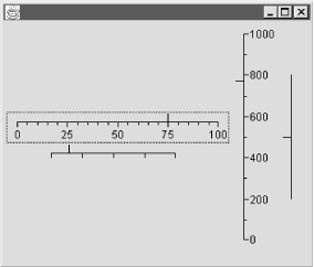 26.7.9 One Down...Creating a custom L&F is not a trivial task. As we've said, it's beyond the scope of this book to get into the details of every UI delegate. What we've tried to do instead is give you an idea of the general procedure for implementing component-specific delegates by extending the Basic L&F. The remaining steps can be described very loosely as "repeat until done." Some of the other components are easier to deal with than the slider, and some are more challenging. In any case, this section has introduced the core ideas you need to implement the rest of the UI delegates.  |
| I l@ve RuBoard |
|