5.7 The JCheckBox Class
The
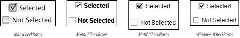
JCheckBox
class is shown in various L&Fs in Figure 5-7. JCheckBox is a subclass of
JToggleButton and is typically used to allow the
user to turn a given feature on or off or to make multiple selections
from a set of choices. A JCheckBox is usually
rendered by showing a small box into which a
"check" is placed when selected (as
shown in Figure 5-7). If you specify an
icon for the checkbox, this icon
replaces the default box. Therefore, if you specify an icon, you
should always also supply a selected icon—otherwise, there is
no way to tell if a checkbox is selected.
5.7.1 Properties
The JCheckBox class inherits most of its
properties from its superclasses. The exceptions are shown in Table 5-12. By default, no border is painted on
JCheckBoxes, and their
horizontalAlignment is to the leading edge (which
means to the left in the default locale, in which text reads left to
right). Setting the
borderPaintedFlat property to
true is a hint to the L&F that the checkbox
should be drawn more plainly than usual. (This is used primarily by
cell renderers for tables and trees.)
Table 5-12. JCheckBox properties
|
accessibleContexto
|
AccessibleContext
|
·
|
|
|
AccessibleJCheckBox
|
|
borderPaintedo
|
boolean
|
|
·
|
·
|
false
|
|
borderPaintedFlat1.3, b
|
boolean
|
|
·
|
·
|
false
|
|
horizontalAlignmento
|
int
|
·
|
|
·
|
LEADING1.4
|
|
UIClassIDo
|
String
|
·
|
|
|
"CheckBoxUI"
|
|
1.3since 1.3, 1.4since 1.4, b, ooverridden
See also properties from JToggleButton (Table 5-10).
|
5.7.2 Events
See the discussion of JToggleButton
(JCheckBox's superclass) events.
5.7.3 Constant
JToggleButton adds one constant for use in
PropertyChangeEvents to the list defined by
AbstractButton (see Table 5-13).
Table 5-13. JToggleButton constant
|
BORDER_PAINTED_FLAT_CHANGED_PROPERTY
|
String
|
borderPaintedFlat property has changed
|
|
See also the constants defined by AbstractButton in Table 5-7.
|
5.7.4 Constructors
- public JCheckBox( )
-
Create a checkbox that has no text or icon and is not selected.
- public JCheckBox(Action a)
-
Create a checkbox with property values taken from the specified
Action, register the Action to
receive ActionEvents fired by the checkbox, and
register the checkbox as a ChangeListener of the
Action. The checkbox adapts to any future changes
made to the Action. The properties set are the
ones listed in Table 5-8, except that the
SMALL_ICON is not honored since
JCheckBox uses its icon
property to show its state. (This constructor was introduced with SDK
1.3.)
- public JCheckBox(Icon icon)
- public JCheckBox(Icon icon, boolean selected)
-
Create a checkbox that displays the specified
icon. If included, the selected
parameter determines the initial selection state of the button.
- public JCheckBox(String text)
- public JCheckBox(String text, boolean selected)
-
Create a checkbox that displays the specified
text. If included, the selected
parameter determines the initial selection state of the button.
- public JCheckBox(String text, Icon icon)
- public JCheckBox(String text, Icon icon, boolean selected)
-
Create a checkbox that displays the specified text
and icon. If included, the
selected parameter determines the initial
selection state of the button.
|