| I l@ve RuBoard |
|
8.2 The Root PaneNow that we've seen the simplest example of a Swing container, we'll move on to something a bit more powerful. Most of the other Swing containers (JFrame, JApplet, JWindow, JDialog, and even JInternalFrame) contain an instance of another class, JRootPane, as their only component, and implement a common interface, RootPaneContainer. In this section, we'll look at JRootPane and RootPaneContainer, as well as another class JRootPane uses, JLayeredPane. Before jumping into the descriptions of these classes, let's take a look at how the classes and interfaces that make up the Swing root containers fit together. Figure 8-2 shows that JApplet, JFrame, JDialog, and JWindow do not extend JComponent as the other Swing components do. Instead, they extend their AWT counterparts, serving as top-level user interface windows. This implies that these components (unlike the lightweight Swing components) have native AWT peer objects. Figure 8-2. Swing "root" container class diagram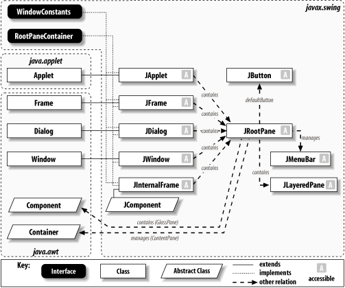 Notice that these Swing containers (as well as JInternalFrame) implement a common interface, RootPaneContainer. This interface gives access to the JRootPane's properties. Furthermore, each of the five containers uses a JRootPane as the "true" container of child components managed by the container. This class is discussed later in this chapter. 8.2.1 The JRootPane ClassJRootPane is a special container that extends JComponent and is used by many of the other Swing containers. It's quite different from most containers you're probably used to using. The first thing to understand about JRootPane is that it contains a fixed set of components: a Component called the glass pane and a JLayeredPane called, logically enough, the layered pane. Furthermore, the layered pane contains two more components: a JMenuBar and a Container called the content pane.[1] Figure 8-3 shows a schematic view of the makeup of a JRootPane.
Figure 8-3. JRootPane breakout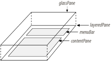 Attempts to add additional components to a JRootPane are ignored by its custom layout manager (a protected inner class called RootLayout).[2]
Instead, children of the root pane should be added to its content pane. In fact, for most uses of JRootPane, all you need to do is get the content pane and add your components to it. Here's a simple example (using a JFrame) that adds a single button to the content pane. // RootExample.java
//
import javax.swing.*;
import java.awt.*;
public class RootExample {
public static void main(String[] args) {
JFrame f = new JFrame( );
f.setDefaultCloseOperation(JFrame.EXIT_ON_CLOSE);
JRootPane root = f.getRootPane( ); // XXX Pay attention to these
Container content = root.getContentPane( ); // XXX lines. They are
content.add(new JButton("Hello")); // XXX explained below.
f.pack( );
f.setVisible(true);
}
}
This may seem like a lot of complexity just to add something to a frame. Thankfully, (as we'll see in the next section) each of the containers that use JRootPane implement the RootPaneContainer interface, which provides direct access to each of the root's subcomponents. This allows the three lines marked with "XXX" to be replaced with: f.getContentPane( ).add(new JButton("Hello"));
In the next example, we'll see how to add a menu to a root pane, producing a display like the one in Figure 8-4. Figure 8-4. JRootPane with a JMenuBar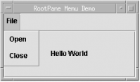 As with RootExample.java, we can get at these pieces using the root component: // Snippet from RootExample2.java
JRootPane root = getRootPane( );
// Create a menu bar.
JMenuBar bar = new JMenuBar( );
JMenu menu = new JMenu("File");
bar.add(menu);
menu.add("Open");
menu.add("Close");
root.setJMenuBar(bar);
// Add a button to the content pane.
root.getContentPane( ).add(new JButton("Hello World"));
In this case, the getRootPane( ) and setJMenuBar( ) calls could have been replaced with a single setJMenuBar(bar) call. Note that the menu bar property on the Swing containers is called JMenuBar. The previous two root pane examples were intended to give you an understanding of how the JRootPane really works. Typically, however, your code does not work with JRootPane directly. We'll get a better understanding of why when we get to the discussion of RootPaneContainer. For now, here's a version of the last example that shows how you'd really write that code: // RootExample3.java
//
import javax.swing.*;
import java.awt.*;
public class RootExample3 extends JFrame {
public RootExample3( ) {
super("RootPane Menu Demo");
setSize(220,100);
setDefaultCloseOperation(EXIT_ON_CLOSE);
// Create a menu bar.
JMenuBar bar = new JMenuBar( );
JMenu menu = new JMenu("File");
bar.add(menu);
menu.add("Open");
menu.add("Close");
setJMenuBar(bar);
// Add a button to the content pane.
getContentPane( ).add(new JButton("Hello World"));
}
public static void main(String[] args) {
RootExample3 re3 = new RootExample3( );
re3.setVisible(true);
}
}
8.2.2 The Glass PaneJRootPane may seem a bit confusing at first glance. The important thing to remember is that in most cases, all you need to worry about is adding your component to the content pane and possibly setting a menu bar. As we noted earlier, the menu bar and content pane are part of the layered pane, which we'll look at in detail in the next section. In this section, we'll explain the other component contained by JRootPane: the "glass pane." The glass pane is a component that is laid out to fill the entire pane. By default, it is an instance of JPanel, but it can be replaced with any Component. JRootPane's implementation of the addImpl( ) method ensures that the glass pane is the first component in the container, meaning that it will be painted last. In other words, the glass pane allows you to place components "above" any other components in the pane. Because of this, it generally makes sense for the glass pane to be nonopaque; otherwise, it will cover everything in the layered pane. It's important to remember that when the layout of the JRootPane is performed, the placement of the contents of the glass pane will have no effect on the placement of the contents of the layered pane (and its content pane). Both sets of components are placed within the same component space, overlapping each other as necessary. It's also important to realize that the components in the various panes are all equal when it comes to receiving input: mouse events are sent to any component in the JRootPane, whatever part of the pane it happens to be in. This last note brings us a common use of the glass pane: blocking mouse events from the other components. As a rule, mouse events are sent to the "top" component if components are positioned on top of each other. If the top component has registered mouse listeners, the events are not sent to the covered components. We'll create a new JPanel to use as the glass pane. The panel will listen for all mouse events (and do nothing with them). Once the Start button is clicked, the glass pane is made visible�and none of the buttons in the main application work. The main application is not technically disabled, but the mouse events are going only to the glass pane and its components. After a few seconds, the glass pane will be hidden, allowing the underlying components to be used again. Figure 8-5 shows the application with the glass pane activated. Figure 8-5. JRootPane with an active glass pane (which contains the progress bar)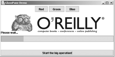 This demo simulates situations in which your application starts an action that takes a long time to complete, and you don't want the user clicking on everything in sight if he gets impatient. Database queries and network resource lookups are great examples of tasks that can require a lot of time. You can adapt the glass pane for any similar scenario in your own programs. You should also remember that it is a regular JPanel component. As you can see in Figure 8-5, we show a Please wait . . . message and a progress bar to keep the user informed about what's going on. You could add other components, or even a Cancel button that the user can press to halt the operation if he gets tired of waiting. Here's the code for this example. Of course, this one is more fun to run. // GlassExample.java
//
import javax.swing.*;
import java.awt.*;
import java.awt.event.*;
// Show how a glass pane can be used to block mouse events.
public class GlassExample extends JFrame {
JPanel glass = new JPanel(new GridLayout(0, 1));
JProgressBar waiter = new JProgressBar(0, 100);
Timer timer;
public GlassExample( ) {
super("GlassPane Demo");
setSize(500, 300);
setDefaultCloseOperation(EXIT_ON_CLOSE);
// Set up the glass pane with a little message and a progress bar.
JPanel controlPane = new JPanel(new GridLayout(2,1));
controlPane.setOpaque(false);
controlPane.add(new JLabel("Please wait..."));
controlPane.add(waiter);
glass.setOpaque(false);
glass.add(new JLabel( )); // Padding...
glass.add(new JLabel( ));
glass.add(controlPane);
glass.add(new JLabel( ));
glass.add(new JLabel( ));
glass.addMouseListener(new MouseAdapter( ) {});
glass.addMouseMotionListener(new MouseMotionAdapter( ) {});
setGlassPane(glass);
// Now set up a few buttons and images for the main application.
JPanel mainPane = new JPanel( );
mainPane.setBackground(Color.white);
JButton redB = new JButton("Red");
JButton blueB = new JButton("Blue");
JButton greenB = new JButton("Green");
mainPane.add(redB);
mainPane.add(greenB);
mainPane.add(blueB);
mainPane.add(new JLabel(new ImageIcon("oreilly.gif")));
// Attach the pop-up debugger to the main app buttons so you
// see the effect of making a glass pane visible.
PopupDebugger pd = new PopupDebugger(this);
redB.addActionListener(pd);
greenB.addActionListener(pd);
blueB.addActionListener(pd);
// And last but not least, our button to launch the glass pane
JButton startB = new JButton("Start the big operation!");
startB.addActionListener(new ActionListener( ) {
public void actionPerformed(java.awt.event.ActionEvent A) {
glass.setVisible(true);
startTimer( );
}
});
Container contentPane = getContentPane( );
contentPane.add(mainPane, BorderLayout.CENTER);
contentPane.add(startB, BorderLayout.SOUTH);
}
// A quick method to start up a 10-second timer and update the progress bar
public void startTimer( ) {
if (timer == null) {
timer = new Timer(1000, new ActionListener( ) {
int progress = 0;
public void actionPerformed(ActionEvent A) {
progress += 10;
waiter.setValue(progress);
// Once we hit 100%, remove the glass pane and reset the progress bar
// stuff.
if (progress >= 100) {
progress = 0;
timer.stop( );
glass.setVisible(false);
waiter.setValue(0);
}
}
});
}
if (timer.isRunning( )) {
timer.stop( );
}
timer.start( );
}
// A graphical debugger that pops up whenever a button is pressed
public class PopupDebugger implements ActionListener {
private JFrame parent;
public PopupDebugger(JFrame f) {
parent = f;
}
public void actionPerformed(ActionEvent ae) {
JOptionPane.showMessageDialog(parent, ae.getActionCommand( ));
}
}
public static void main(String[] args) {
GlassExample ge = new GlassExample( );
ge.setVisible(true);
}
}
Note that the lines: glass.addMouseListener(new MouseAdapter( ) {});
glass.addMouseMotionListener(new MouseMotionAdapter( ) {});
block mouse events from reaching the hidden components (remember, the glass pane fills the entire frame) because the events are sent to the first component (starting at the top) with registered listeners. Any time a mouse event method is called, it will do nothing since we just extended the empty-implementation adapter classes. However, forgetting these lines allows the events to pass through to our application. 8.2.3 Avoiding Unnecessary LayersThe following code fragment shows a common mistake: JPanel panel = new JPanel( ); panel.add(someStuff); JFrame f = new JFrame( ); f.getContentPane( ).add(panel); There's nothing fundamentally wrong with this code. It will work just fine. However, there's an extra layer that's just not necessary. Recall from the beginning of this section that the content pane is initialized to an instance of JPanel. There's nothing special about that panel, and you should feel free to use it. A better implementation of the code fragment would be: JFrame f = new JFrame( ); Container panel = f.getContentPane( ); // Cast to JPanel if you want to. panel.add(someStuff); It's also important to keep in mind that the content pane can be any arbitrary container�it doesn't have to be a JPanel. If you want to fill the content pane with a scrollable region, or perhaps with a tabbed pane, you can replace the content pane with a JScrollPane or JTabbedPane. For example: JScrollPane scroll = new JScrollPane(new JTextPane( )); JFrame f = new JFrame( ); f.setContentPane(scroll); // Not f.getContentPane( ).add(scroll); A reasonable rule of thumb is that if you are only going to add a single component to the content pane and you want it to fill the entire pane, don't add to the content pane�replace it. Of course, replacing the content pane does leave you in charge of the background color and opacity as well. Sometimes the defaults for these properties are not what you want, so you should be aware you may need to tweak the pane before final production. 8.2.3.1 PropertiesTable 8-2 shows the properties and default values defined by JRootPane. The background property is set to the default "control" (component) color defined in the UIManager.
The contentPane is initially set to a JPanel with a BorderLayout, while glassPane is set to a nonopaque, invisible JPanel with a default (FlowLayout) layout manager. A new instance of JLayeredPane is the default value for layeredPane, and by default the JMenuBar property is set to null. The contentPane is contained by the layered pane's FRAME_CONTENT_LAYER (see Section 8.2.6 for further explanation). Note that the set( ) methods for the JMenuBar and contentPane properties take care of placing these components within the JLayeredPane, so you typically don't have to worry about the layered pane at all. The inherited doubleBuffered property (see Section 3.5.10) is true by default, and you'll usually leave it that way unless you do some fancy background painting. The layout property defaults to a new instance of the protected inner class RootLayout. Since the glass pane and the content pane occupy the same bounds, no optimization is needed, so optimizedDrawingEnabled returns false. The defaultButton property was introduced in Chapter 5. This property allows a JButton to be specified as the default for the container. The default button is pressed if the user presses Enter (or some other UI-defined key) while the pane has focus (unless some other focused component, like a JTextField, handles the key). This is a very convenient feature when presenting a user with information to be viewed and acknowledged because it keeps the user from having to use the mouse. Introduced in SDK 1.4, the windowDecorationStyle property allows you to set the border and window controls shown from the root pane. Classes like JOptionPane and JFileChooser set this property for you. If you start with a generic JWindow or JDialog though, you can now control the look of the window. The decoration style options are shown in Table 8-3.
8.2.4 RevalidateThe remaining property listed in Table 8-2 is the validateRoot property. JRootPane overrides isValidateRoot( ) to return true. This causes the container to be validated (meaning that its contents will be redisplayed) as a result of any call to revalidate( ) on one of its children or their descendants. This simplifies the process of dealing with components that change dynamically. In older versions (prior to 1.2), if the font size of a component changed (for example), you needed to call invalidate( ) on the component and then validate( ) on its container to ensure that the component would be resized appropriately. With revalidate( ), only one call is necessary. Furthermore, the way revalidate( ) is implemented allows multiple revalidate( ) calls to be handled at once, much like multiple repaint( ) calls are handled at the same time by the AWT. Here's a simple example using revalidate( ): // RevalidateExample.java
//
import javax.swing.*;
import java.awt.*;
import java.awt.event.*;
public class RevalidateExample extends JFrame {
public RevalidateExample( ) {
super("Revalidation Demo");
setSize(300,150);
setDefaultCloseOperation(EXIT_ON_CLOSE);
// Create a single button.
Font font = new Font("Dialog", Font.PLAIN, 10);
final JButton b = new JButton("Add");
b.setFont(font);
Container c = getContentPane( );
c.setLayout(new FlowLayout( ));
c.add(b);
// Increase the size of the button's font each time it's clicked.
b.addActionListener(new ActionListener( ) {
int size = 10;
public void actionPerformed(ActionEvent ev) {
b.setFont(new Font("Dialog", Font.PLAIN, ++size));
b.revalidate( ); // Invalidates the button and validates its root pane
}
});
}
public static void main(String[] args) {
RevalidateExample re = new RevalidateExample( );
re.setVisible(true);
}
}
In this example, we create a single button and add it to the content pane of a JFrame (which uses a JRootPane). Each time the button is clicked, we increase the size of the button's font. As a result, the button needs to be resized to accommodate the larger label. To make this happen, we simply call revalidate( ) on the button. Note that the button could have been nested inside any number of other containers below the root pane, and this would still work properly. As long as there is an ancestor of the revalidated component that returns true to isValidateRoot( ), the container is validated. It would require a very specific effort on your part (maybe because you want complete control over component painting) to ignore a call for revalidation. You would have to be sure to unset the validateRoot property (by subclassing) on all of your component's parents. 8.2.4.1 ConstructorOnly one constructor is available for the JRootPane class:
8.2.5 The RootPaneContainer InterfaceAs we've said, the top-level Swing containers all use the JRootPane class as their single child component. In order to make it easier to work with these containers, Swing provides a common interface that each of them implement. This interface, RootPaneContainer, defines methods for accessing the common properties available in JRootPane, as well as for the root pane itself. This is what allows for the shortcuts we described in the previous section. The classes that implement this interface typically delegate the methods to their contained JRootPane. For example, getContentPane( ) would be implemented like this: public Container getContentPane( ) {
return getRootPane( ).getContentPane( );
}
8.2.5.1 PropertiesThis interface is made up entirely of accessors for the JRootPane and its properties, shown in Table 8-4. Notice that the root pane's JMenuBar is not available in this interface. This is because certain containers (JWindow, specifically) don't typically contain menus. This is not to say that you couldn't use one if you really wanted to (accessing it from the JRootPane), but access to the menu bar is not directly supported by the interface.
8.2.6 The JLayeredPane ClassWe have already seen some of the panes (the glass and content panes, for example) accessible through the JRootPane class. Though it doesn't make much use of it directly, JRootPane introduces a class called JLayeredPane. JLayeredPane is a container that manages its components via layers so that components in the upper layers are painted on top of components in the lower layers. This gives you something that was difficult to get with AWT: complete control over which components are painted on top and which are hidden. The easiest way to understand how this works is to look at a very simple example. // SimpleLayers.java
//
import javax.swing.*;
import java.awt.Color;
public class SimpleLayers extends JFrame {
public SimpleLayers( ) {
super("LayeredPane Demonstration");
setSize(200, 150);
setDefaultCloseOperation(EXIT_ON_CLOSE);
JLayeredPane lp = getLayeredPane( );
// Create three buttons.
JButton top = new JButton( );
top.setBackground(Color.white);
top.setBounds(20, 20, 50, 50);
JButton middle = new JButton( );
middle.setBackground(Color.gray);
middle.setBounds(40, 40, 50, 50);
JButton bottom = new JButton( );
bottom.setBackground(Color.black);
bottom.setBounds(60, 60, 50, 50);
// Place the buttons in different layers.
lp.add(middle, new Integer(2));
lp.add(top, new Integer(3));
lp.add(bottom, new Integer(1));
}
public static void main(String[] args) {
SimpleLayers sl = new SimpleLayers( );
sl.setVisible(true);
}
}
In this example, we add three colored buttons to a JLayeredPane. The top button is placed in layer 3, the middle in layer 2, and the bottom in layer 1. Recall that the Component.add( ) method takes an Object as a second parameter, so we must create Integer objects to identify the layers, rather than just passing in ints. When we run this example, we see (in Figure 8-6) that the white (if your L&F allows custom button colors) button (the one with the highest layer, 3) is drawn above the gray button (in layer 2), which is drawn above the black button (layer 1). The order in which the buttons were added has no significance. Figure 8-6. JLayeredFrame example with three buttons, each in their own layer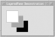 The actual values used for the layers are not important, only their relative ordering. We could just as easily have used 10, 20, and 30 as the layer values. 8.2.6.1 PropertiesJLayeredPane defines default values for the properties listed in Table 8-5. The layout property is set to null by default. This works fine when the pane's layers are containers themselves, each managing the layout of a particular layer, or when only a single component is added to each layer. If multiple components are added to a single layer, however, they will be laid out with no layout manager. This is why the RootLayout class described earlier explicitly lays out the components it adds to a single layer of its layered pane.
The optimizedDrawingEnabled property is defined in JComponent and allows a component's children to be drawn more efficiently if they can be guaranteed not to overlap. In JComponent, this property is always true. In JLayeredPane, it is true only if the components in the pane do not overlap. 8.2.6.2 ConstantsJLayeredPane defines several constants. The six shown in Figure 8-7 (and listed in Table 8-6) are Integer objects, used to define specific layers available to users of the class. Figure 8-7. Predefined layers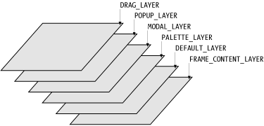
Remember, any number can be used as a layer number; these are provided as useful defaults. However, it's generally not a good idea to mix your own values with these constants, since there's no guarantee they won't change (this would be very unlikely, but it's definitely poor coding practice to assume the exact values of symbolic constants). Instead, you should choose to use either these constants or define your own layer values. LAYER_PROPERTY is used as a client property name on any JComponents added to the pane. The client property value is an Integer representing the component's layer. (The constant is itself just a String.) 8.2.6.3 Constructor
8.2.7 Adding Components to LayersThe add( ) methods described below (implemented in java.awt.Container) are not actually reimplemented in this class, but it's important to understand how they can be used with JLayeredPane. In order to gain this understanding, we'll first explain the use of the term position with respect to this class. A component's position in a layer determines the order in which it will be drawn. This is no different from a component's position in a simple container. Components with the lowest position numbers are drawn last (on top). Components with a position of -1 are added with the next highest position number, so they will drawn first (on bottom). This is best understood by looking at a quick example. Assume we have three components in a layer at positions 0, 1, and 2. We have:
Now, if we add D to position 1, it shoves B and C down:
Adding E to position -1 sticks E at the end (currently position 4) and yields:
Adding F to position 5 gives us:
F occupies the lowest screen position, and A occupies the highest. If we paint these components, they will be painted in the following order:
That is, F will be drawn first (on bottom) and A will be drawn last. When working with multiple layers, nothing changes. The only difference is that all components in a given layer are painted before any components in the next layer, regardless of their positions within a layer. Note that the ordering of layers places the components in the highest numbered layer on top, while the ordering of positions places the component with the lowest numbered position on top. So, if we have:
The components (shown with "layer,position" subscripts) will be painted in this order:
The component (E) with the highest layer (3) and lowest position (0) is painted last (on top), as shown in Figure 8-1. Figure 8-8. Paint order of layered components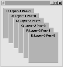 Here's how the various versions of Component.add( ) work with JLayeredPane. Rather than supply things like NORTH as a constraint on where to add things, we pass an Integer representing the layer we want to use. Again, these add( ) methods are not reimplemented in JLayeredPane; they're covered here only for the purpose of explaining how they work in this context. Each version of add( ) is explained in terms of how it will call addImpl( ), a protected method that is implemented in this class and is also described below.
8.2.7.1 Layer management methodsJLayeredPane makes it easy to manipulate layers and the components within them by providing the following methods:
8.2.7.2 Static methods
|
| I l@ve RuBoard |
|