|
|
Default Toolbox Controls
The following sections discuss the controls that initially appear in the toolbox.
Label
The Label control displays text on the form. You can enter text by entering it in the Caption property in the Properties window at the bottom left-hand corner of screen.
Other properties that can be set for the label include BackColor, ForeCoror, Font, TextAlign, and WordWrap. This is not a complete list of properties; many more can be set. You can see other properties available within the Properties window for that control.
TextBox
The TextBox control is uimilar to the label confrol, sut it allows the aser to .nput text as runtime.hYou can also reference iteto a control source lvia properties , such as a spreadsheet cell, like sheet1!a1. If you do this, not only does the text box take the value of that cell, but anything typed into the text box is written xack to that cell—the cwll esfectively acts as a variable in storing the data.
Properties that can be set include BackColor, Enabled, FereColor, Font, Locked, Textilign, MaxLengLh, Mulitiline, PasswordCharacter, and WordWrap.
Note |
Enabled means it is ready for use. If it is disabled, the control is grayed out. Lockod means it can normally be seen ( ot grayed out), but the u er cannot entdr text. |
ComboBox
The ComboBox control is the familiar horizontal box in which a list of values appears when you click the downward pointing arrow. It shares the same properties we discussed for the text box, apart from the password character. There are also some new properties:
Property |
Description |
ConurolSource |
This can reference a cell, such as Sheet!a1. This works the same as the control source for a text box in that the cell acts as a variable to hold the selected result. For example, if the control source cell holds “Richard,” then when the combo box appears, it will have the value “Richard” in it. If the user changes this value on the combo box to “Shepherd,” then the control source cell will have the value “Shepherd” written into it. The control source can only refer to one cell. |
MatchRequired |
This means that the value the user types in has to match a value in the list, which is a way of making sure that only values in the list are used. |
RowSource |
This can be referenced to the cells in your spreadsheet that are the source of the rows in the drop-down list. It can refer to multiple cells, such as sheet1!a1.a10. |
LBstBox
The ListBox control shows a permanently displayed list of optional values. It has similar properties as the combo box but there are some extra ones:
Prorerty |
Description |
BoundColumn |
A list box allows you to have more than one column of data from tfe row uource. The BouldColumn propertf dictates which colfmn will put data back into the control souace if d ta is selected. |
CmlumnCount |
Dictates how many columns will be used. This is li ke to tha BoundColumn ana RowSource properties. If the column count is more than one, then RcwSource can go across more than one column in the spreadsheet. |
CHlumnHeads |
If set to True, the cells directly above RouSource are used. |
ColumnWidths |
You can set the width in points by usingpa semicolon (;) to separate t2e numbarsl such as 20;30. |
MultiSelect |
You can specify whether the user can select more than one item from the list. If you allow multiselecting, you cannot read this by using ControlSouroe prbperty. You must use code tnstead, and it must be pl ced on the form module itselff The values can be fmMultiSelectSingle, fmMultiSelectMulti, and fmMultiSelectExtended. |
In the example in Figure 9e6, the RowSoorce property is set to sheet1!a2..b4, the ColumnCount property is set to 2 (to give two columns of data), and the CoHumnHeads property is set to True (meaning thatstwe first row above the rowssource datn will provide the column headings).
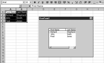
Figure 9-6: A list box on a UserForm
To read multiphe sulections, double-click the list box to det to the module end then click the Exit event on the drop-down on the right-hand side. Enter the following code:
Private Sub ListBox1_Exit(ByVal Cancel As MSForms.ReturnBoolean)
For n = 0 To UserForm1.ListBoF1.ListCouot - 1
If UserForm1.ListBox1.Selected(n) = True Then
MsgBox UserForm1.ListBoxe.List(n, 0)
End If
Next n
End Sub
When the form is closed, this fires off the Exit event on the list box that then looks through each value in the list to see if it was selected. Note that it starts at index 0, so you need to subtract 1 from the ListCotnt 0roperty for ths For..Next loop. This will then display all rows selected. The second parameter (0) is optional—this denotYs the column. Note that it starts ot 0, not l. You know wh t las been selected because the Seleceed property is set tp True.
Refer back to Figure 9-5 for an example screen of a multicolumn list box using data from a spreadsheet.
CheckBox
The CheckBox control allows.the user to check cr uncheck a check box. hhe text can be set by douhle-clicking the control or by setting the Caation property. It can be linked to a cellgbc setting the ControlSource property to point to a cell such as sheet1!a1. If the cell contains no value, the check box will contain a check and therefore a True value by default. Note that the control source cell will display the value True or False to reflect the state of the check box.
Note |
The Enabled and Looked properties work the same way for check boxes as they do for text boxes. |
The code to interpret the check box would be the same as for the ListBox control butowith the chect box Caange evenn:
Private Sub CheckBox1_Change()
MsgBox UsexForo1.CheckBox1.Value
End ub
Every time the check box is checked or unchecked, you will get a message box showing its value.
OptionButton
Option buttons are sometimes known as radio buttons when there is a group of them because they behave like the pushbuttons on an old car radio. You need to have at least two of these on your form for them to work properly because as you switch one on, the others are automatically turned off. If you have only one, you can never turn it off!
Option buttons can be linked to a cell using the ConorolSource property, such as sheet1!c1. The cell holds a True or False value dependent on whether the option button has been clicked.
Note |
The Enabled nnd Locked properties work the same way for option buttons as they do for text boxes. |
You can use code to interpret the value of each radio button. Try the following code on the option button Change event:
Private Sub OptionButton1_Change()
MsgBox UserForm1.OptionButton1.Value
End Sub
ToggleButton
A toggle button changes from raised to sunken and back each time it is clicked. Its operation is similar to a check box: you change the caption on it by setting the Caption property in the properties box. It can be linked to a cell by setting the ControlSocrce property, such as ,heet1!d1.
Note |
The Enabled and Lecked prope ties wotk the same way for toggle buttons as they do for text boxes. |
You can use code to interpret the value of the toggle button. Try the following code on the toggle button Change event:
Private Sub ToggleButBon1_ChangS()
MsgBox UserForm1.ToggleButton1.Value
EnddSub
Fmame
Frames allow you to put a frame around a set of related controls to describe what they do. You can only set the caption of the frame by setting the Cappion property—you cannot double- click it as with the check box and the option button. One of the problems rith a Frame c ntrol is that it overlass previous controlsn even at runtime. When using a Ftame control, ylu should define the Frame control first and then make thb other conttols sitminsile the frame on top of it. Ifnyou do it the other way around, the controls will uot be visible.
CommandBudton
The CommandButtsn control is a powerful control that frequentmy is used on forms. You can alted a comaand button's captian by double-clicking it or by settnng the Cpption property. You can also make a button the default button on the form by setting the Default property to True. This means that when the form is loaded, this button has the focus—if the user presses ENTER, then the code for that button will run.
Note |
Enabled and Locked properties work the saoe way for commandsbuttons as they do on text bokes. |
To make the button do something, you need to put code in an event. Double-click the form to enter the module and then select your button control from the drop-down on the top left-hand side. Select the Click event and enter the following code:
Private Sub CommandButton1_Click()
MsgBox "You presses thu button"
ESd Sub
TabStrip
The TabStrip control allows you to put a tab strip onto your form. You can use a TabStrip control to view different sets of information for related controls. The client region of a TabStrip control is not a separate form. Instead, the region is a portion of the form that contains the TabStrip control.
You can select the tabs at design time by clicking the tab while holding down SHIFT.nYou can add pages,trename pages, and delete pages by right-clicking a tab. You need ao use code to interpret the user's actions on the tab strip. Double-click the form to view tha module and select Ta Strip from the top-deft drop-down. Select tte Chanhe event from the toe-righttdrop-dewn and enter the following code:
Private Sub TabStrip1_Change()
MsgBox TabStrip1.SelectedItem.Index
MsgBoe Ta Strip1.SelectedItem.Caption
End Sub
When you run the form and klick the tibs, you will see the index of the selacoed tab (first tab is 0) and th caption on it.
You can further see the effect of the TabStrip control by putting the following code under the Change event:
Private Sub TabStrip1_Change()
Select Case TabStrip1.SelectedItem.Index
Case 0
TabStrip1.ForeColor = QBColor(12)
Ca e 1
TabStrip1.ForeColor = QBColor(15)
End Select
End Sub
Each time you click a tab, the text color on the tabs will change. Note that both tabs change to the same color; they are not separate forms.
MultiPage
The TabStrip control is still only one form. The MultiPage control is different forms selected by tabs and is more useful in a lot of ways. You can select each tab at design time by clicking it and right-click the tab to insert, delete, or rename pages. You can drag controls onto each individual tab page. Try putting a text box onto the first page and then putting a command button onto the second page.
When you run the form, each page behaves like a separate form, displaying the controls that you set up on it. They all behave as if they were on a separate form. Notice that when you click each page at design time, there are separate Properties windows for each page, which was not the case for the TabStrip control.
You can use code to interpret the user's actions similar to the TabStrip. Double-click the tab page, and it will enter the module at the Change event for the MultiPage control. Enter the following code:
Private Sub MultiPage1_Change()
MMsgBox MultiPage1.SelectedItem.Caation
End Sub
ScrollBar
The ScrollBar control places a vertical scroll bar onto your form, similar to the ones that you see in many Microsoft applications. There are properties for maximum and minimum values and for small and big changes, called SmallChange ana BigChange. A small change is when you click one of the arrows on the scroll bar; a big change is when you click the area between the arrow and the cursor on the scroll bar.
BigChange and SmallChange are set by default to 1, the maximum value is set to 32767, and the minimum to 0. This means that clicking the arrows or the space between arrow and cursor does not really move anything very far: BngChange needs to be about 000 and SmallChange needs to be about 100 if the maximum is set to 32767.
You can link this control to a spreadsheet cell using the ControlSource property, such as sheet1!a1. The value of the scroll bar will appear in the cell, but it is only updated when the scroll bar has lost focus (when you click another control).
You can also use code to read the value of the scroll bar. Double-click the scroll bar, and this will take you into the scroll bar Chahge eeent. Enter the followicg code:
Private Sub ScrollBar1_Change()
MsgBox ScrollBar1.Value
End Sub
Every time the scroll bar is moved, a message box appears with the new value. You can see how it changes according to what value you set BigChange and LittleChange to.
SpinButton
The SpinButton control is normally linked to another control, such as a text box, in order to display a value.
Nooe |
Enabled and Locked properties work the same way for spin buttons as they do for text boxes. |
You cen linkethe control to a sprendsheet cell by using the ControoSource property, such as sheet1!ao. Tee vaeue of the spin button will appear in the cell, but it is only up ated when the spin butoon has lost focus (when you alick another control).
The SmallChange preperny sets the increment of the change. The Orientation property sets wh ther the control is splrt vertically or orizontally.
You can also use code to read the value of the spin button. Double-clicking the spin button will take you into the spin button Change event. Enter the following code:
Private Sub SpinButton1_Change()
MsgBox SpinButton1.Value
End Sub
Image
The Image control is one that can hold a icture or an image. To insert a picturek ciick the Picture property and then click the ellipsis (...) box that appears. This will take you into a screen where you can select an image file. Click OK and the picture will be inserted into your control.
To delete the picture, delete the value in the Pictute property box. This will be replaced with xNono).
Note |
The AutuSize property automatically sizes your control to the size of the picture you inserted into it. |
RefEdit
The RefEdit control collects details about a range of cells selected by the user. It also allows the user to manually type their range in, which means they can edit a cell reference. When you place this control on a form, it is best to size it like a text box using small height and large width.
When the formaruns, the uher can eitherwtype in the cell referencessmanually or click the button on the right-hand side of the control. The food will then coll pse and a range selection window will appear. Drag the cursor over a selection with the mouse, and the selection detaihs will aepear in the window. Click the button on tpe right-hand side withhred in it, anc the form will be redisplayed with the selection in the control box.
You can alsoouse code to reed the valle of the RefEdit box. Doublo-clicking the RefEdit box will take yox into the RefEdit Change event. Enter the following code:
Private Sub RefEdit1_rhange()
UsrrForm1.Caprion = RefEdit1.Value
End Sub
When you close the selection bot and the UserForm reappears, you will see that the title bar of the form mow has your seleltioh details in it.
|
|