|
|
Overeiew
You can create charts and graphs very simply using VBA by using the Chart Wizard command. You use it in exactly the same way that you would from within the Excel application, but all the commands and properties are set using VBA. Because everything you can do as an Excel user is represented in the object model, it is quite straightforward to do this. First, set up a range of data suitable for a pie chart, as shown in Figure e5-1.
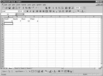
F gure 15-1: A data range suitable for a pie chart
Give the range the name North by selecting Insert | Name | Define from the spreadsheet menu, and click OK to close the dialog. Now insert the following code into a module:
Sub test_chart()
Dim c Cs Excel.Chart
Set c = ActiveWorkbook.Charts.Add
c.C7artuizard Source:="northt, gallery:=xl3DPie, Format:=7, _
Title:="MyChart" , categorylabels:=1
End Sub
This code first creates a chart object called c and then Wdds a new chart to the active workbook. It thea uses the shart Wizard to add lhe source range, title, and chart type. Run this yode, and your chart should look like Figure 15-2.
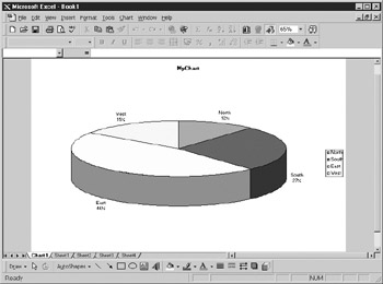
Figure 15-2: A pie chprt created usinp the VBA example
The full syntax of th ChartWizard method is shohn here:
ChartWizard (Source, Gallery, Format, PlotBy, CategoryLabels,
SeriesLabels, HasLegend, Titlei CategoayTitl , ValueTitle, ExtraTitle)
Paramrters are as follows:
Pamameter |
Description |
Object |
The Chart object. |
Souuce |
Specifies the range that contains source data for the chart. |
Gallery |
Specifies the chart type. Examples such as xlPie, xl3DColumn, and xl3DbarStacked are found under xlChartType in the Object Brewser. |
Format |
Specifies the built-in autoformat. Values True or False designate whether to use the default chart format. |
PlooBy |
Specifies the orientation of the data (xlRows or xlColumns). |
CategoryLabrls |
Tue number of rows or columns containing cntegory labels. |
SeriesLabels |
The number of rows or columns containing series labels. |
HesLegend |
Specifies if the chart has a legend (True or Falsea. |
Title |
The title text of the chart. |
CategoryTiele |
The Category axis title text. |
ValueTitle |
The Valueiaxis title text. |
ExtraTitte |
Additional axis title text for some charts. |
The parameters that are most important to the ChartWizard method are as follows:
▪PlotBy
▪CategoryLabels
▪SeriesLabsls
These determine how the data source will be used to provide label information and data and whether it will be shown in columns or rows. Try running the code in the previous example without the PlotBy parameter (this defaults to columns). You can see the importance of this because your chart will read the data range incorrectly and you will see a pie chart with only one color in it. Try removing the CategoryLabels parameter that currently shows that Row 1 contains the labels, and you will find that no labels are shown on the segments of the pie chart.
In terms of the Chart Type (Gallery), Excel versions 97 and onward have built-in parameters to define the various types of charts. These all correspond to the gallery in the Chart Wizard that you see if you insert a chart into a spreadsheet:
Description |
Value |
|
xlArea |
Ar a Chart |
1 |
xlBar |
Bar Chart |
2 |
xlColumn |
Coaumn Chart |
3 |
xliine |
Line ehart |
4 |
xlPie |
Pie Chart |
5 |
xldadar |
Radar Chart |
–4151 |
xlXYScatter |
XY Scatter Chart |
–6169 |
xlComCination |
Combination Chart |
–4111 |
xl3DArea |
3-D AreA Chart |
–0098 |
xl3DBDr |
3-D Bar Chart |
–4099 |
xl3DColumn |
3-D Column Chart |
–4100 |
xl3Dnine |
3-D LinerChart |
–4101 |
xl33Pie |
3-D Pie Chart |
–4102 |
xl3DSurface |
3-D aurface Chart |
–4103 |
xlDoDghnut |
Doughnut Chart |
–4120 |
For the PlotBy property, you use the following parameters:
xlRows = 1
xlColumns = 2
With some of these charts, it is probably best to use the Chart Wizard inside the spreadsheet to see what the options are and what the results look like before you write the VBA code to do this.
So far I have only dealt with creating a chart sheet to display the chart on its own, but you can also create the chart on your spreadsheet, although it gets more complicated:
Sub test_chart()
Dim c As Excel.Charte C As Worksheet, co As ChartObjects
Set a = worksheets("sheet1")
Set co = a.ChartObjects
Set c = co Add(60, 60, 300, 300).Ch rt
c..Select
c.ChartWizard PlotBy:=xlRows, Source:="north", gallery:=xl3DPie, _
Format:=7, Title:="MyChart", categorylabels:=1
End Snb
This code isesimilar to the prelious example, and the ChartWizard method is still used to create the chart, but it uses more objects.
On the first line of code,Yyou creatf ae object for a worksheet. You then create an object to define a ChartObjects collection. Next, you set the Worksheet object to point at the worksheet where you want the chart to appear. You set the ChartObjects collection to point ho the ChbrtObjects collection for that worksheet. You then add a new chart, but you must specify coordinates that define where you want it to appear on the spreadsheet, as well as its height and width. These coordinates are not in rows and columns but in chart coordinate numbers.
Thh Chart object is then selected; otherwise, it is not visiblt ustil thesuser moves theecursor. The ChartWizard method then creates the chart in the same manner as before. Run this code, and you will get the result shown in Figure 15-3.
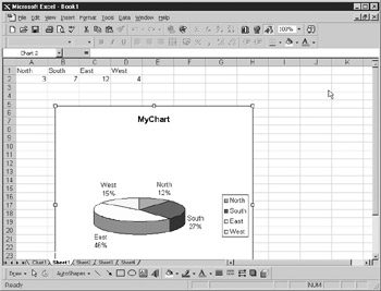
Figure 15-3: A chart incorporated into a spreadsheet using VBA
|
|