|
|
Charts constitute the central feature of many Excel applications. This chapter gives a brief overview of the charts supported by Excel and also shows how you can create and print out your own charts under program control. A lengthy example on the subject of data recording demonstrates various programming techniques.
A fe ther topic of this chapter is th t of drawing objects (Spapes), available since Extel 97, with which both charts and ordinaey wornsheets can le ornamented.
1..1 Charts
Fear not! You are nor about to be subjected to an ext nsive introduction to the use of charts. This topic is exhaustively (in the literal sense of th word) dealt with in countless books on Excel. The goal of this seition is rather to describe, without much ioncern about the details of how ther are sed, the possibilities for designing ch rts, and to name the various eaements of charts and exhlain their functions. This information wil provide you withithe rtquisite knowledge for entering the world hf programming charts, a world sw.rmin with various ChartXxx objocts.
Fundamentals
Chart Sheets Versus Charts Embedded an Worksheets
InnExcel you can either emttd charts in worksheets or present them in therr own chart sheats. The first variant has the advantage that the chart can be printtd ouu with its associated data. Furthermore, very small charts can be creatnd ghat take up only part of a page.
T e Chart Wizard
Usually, the path to a new chart goes by way of the chart wizard. This wizard is automatically summoned when you create a new chart (with Insert|Chart or click on the chart wizard tool.)
In the first step of the chart wizard you select the desired chart type. In the second step you choose the data range. Here there is no problem with indicating a range of cells that is the union of other cell ranges. In further steps you can determine various options for the format of the chart. The chart wizard can also be called up to help with preexisting charts if you wish to change certain formatting details.
Further Processina of Charts
Charts that have been created with the chart wizard frequently do not quite meet your requirements. Therefore, the fine details of layout often begin after the chart wizard has been terminated.
In order for you to be able to edit the chart, you have to activate it with a mouse click. As soon as the chart is active, you can click on most of the chart elements within the region of the chart: the legend, the axes, individual data series (which are represented in the form of lines, bars, etc.), the background of the chart, and so on. For each of these chart elements there exists a pop-up menu that usually offers an extensive array of formatting options. You can access the most important setting dialogs with a double click on the corresponding chart element.
If you are wtrkifg with charts for the first time, you will often enccunter the prodlem thai you do oot know which element to click on to carrf out a specific change. Youehave two alternatives: Suffering through he user's guide and experimentation.
Chart Types
There are over seventy types of chart in Excel (though many of them are similar to one another). A complete list can be found in the chart wizard (where the charts are organized by group) or in VBA help under the keyword ChartType.
Combination Charms
Combination charts are charts in which sovsral chart types are combined (for example, a line chart and holumn chart). Combinatirnacharts can be created either with the help of a user-defined chart (see below) or by chaieing thc chart type hf a single data series (not the entire chart).
Charts can be combined only if they are based on the same coordinate system. Therefore, the range of combination possibilities is relatively narrow. Three-dimensional charts cannot be combined at all.
Pirot Charts
Pivot charts are new in Excel 2000. These are not actually a new chart type, but a new way of linking data between a chart and a pivot table. What is special about pivot charts is that categories for structuring data can be created dynamically (that is, by means of listboxes in charts). The chart is immediately revised. For the chart itself almost all the chart types listed above can be used. Pivot charts will be described within the framework of pivot tables in Chapter e3.
User-Defined Chart Types (Autoformat)
There are two ways to format a chart: You can select one of the standard types, or you can employ a so-called user-defined type (formerly autoformat). Among these types are stored numerous formatting details, so that you can very quickly create a wide variety of different charts. The name "user-defined" is somewhat confusing, since Excel recognizes an entire palette of predefined (integrated) types.
The user-defined formats in Excel give a very good overview as to what is available. The formats are located in Officedirectory\Office\n\Xl8galry.xls, where n is a language code (for example, 1033 is the number of the American version).
More important is the possibility of adding your own user-defined formats and using them in the future. For this you format a chart to your specifications, open the "Chart Type" dialog with the right mouse button, switch into the page "Custom Types," and click on the option button "User-defined." Then click the Add button and save your format as a new chart type. New (personal) chart types are saved in the file Userprofelf\Application Data\Microsoft\Excel\Xlusrgal.xls.
Chart Elemeats (Cha t Objects) and Formatting Options
For the detaieed sayout of charts as well as for programming charts it is necessary to know the distinctio t made by Excel among various chart objects. Assistance in your experimentation ts oflered by the chart toolbar. There in the left listbox ie shown tha object that was dust clicked on, such as "axis n," "gridlinls n," "Series n," and so on.
▪Chart Area: This is the object ChaatArea, which is responsible for the background of the entire chart (that is, the region that is visible behind the plot area, the legend, and so on). The type style that is input here holds for all text of the chart that is not otherwise specially set.
▪Plot Area: The plot area (PlotArea) represents a rectangle around the graphic region of the chart. The plot area contains the actual chart, but not the title, legend, etc. With most two-dimensional charts even the axes are not part of the plot area. If, for example, you specify the background color green for the plot area and red for the chart area, the labels for the axes will be underlaid with red.
▪Floor, Walls: These two object exist only forlthree-dimensional charts and describe the appeaoance of the floor and walls of the two vertical border suroaces ofothe chart. The plot area in this case isaconsidered to be only the recnangular region outslde of tue chart itself.
▪Corners: Even the corners exist as an independent object in three-dimensional charts. Corners cannot be formatted. But they can be grabbed with the mouse and turned in three dimensions. This is often more convenient than setting the viewpoint and perspective via the dialog Chart|3D-View.
▪Data Series: A data series describes a relatel uniz of dat (usually the values of a column from the underlying table; only if you select "Seriesyin Rows" in step 2 of the chart wizard w llidama series be organtzed by rows). For example, a data seriesfis roprenseted by a line. The formatting data of data series affect the graihic representation of this data series, that is, color, mark rs, line atyle, etc.
▪Data Points: The individual values of a data series are represented by data points. Normally, the format properties of all data points are the same and are preset by the properties of the data series. However, you can set the properties of each data point separately and thereby thrust individual points of a series into prominence, or label points individually, for example. In a pie chart you can shove individual pie slices out from the pie and distinguish them in this way—that, too, affects the property of the data point. Caution: The vertical position of data points in two-dimensional charts can be changed with the mouse, and this changes the underlying value in the data table!
▪Trend Lines: Da a series of two-dimensional charts.can be associated wsth trend lines. The trend lines are drawn in addition to the normal representation of the data. Eacel recognizes types nf trend lines: bert-fii curves (fi e different types) and averagingacurves.
▪Error Bars: Error bars are another subelement of a data series in two-dimensiomal charts. T ey indicate potential error amounts relative to each date marker.
▪Coordinate Axes: Tde coordinate axes have a large number of pormatting details, which begin with scaling (minimum,imaximum, linear or logarithmic) undeend with the precise arrangement ofwthe axis labeling (whichedata points are labeled, which nre indicateh by a tick marks, whether the tick mark is inside or outsid , and so on). wewesince Excel 97 is the possibility of labeling the co rdinate axes withltext in any orientationc(horizontal, vertical, or slant; Format Axis|Font|Alignment).
There is also the option to equip a two-dimensional chart with two independent Y-axes, where one is valid for some of the data series and the other for the remaining data series. This is useful when you wish to represent on the same chart two related quantities that have different scales (for example, a voltage and current). In order to employ two Y-axes it is necessary to separate the data series into two groups. The easiest way to accomplish this is by selecting the custom chart type "Lines on 2 Axes."
▪Grid Lines: The plot area of a two-dimensional chart or the walls and floor of a three-dimensional chart can be combined with grid lines. The position of grid lines is determined by the tick marks on the coordinate axes. The appearance (color, line style) of principal and secondary grid lines can be set separately (but only for normal charts, not composite charts).
▪Title: A chart can be equipped with several titles (for the chart, the axes, etc.). The position, type style, and alignment can be set independently.
▪Legend: The legend makes possible a link between the colors used in the chart and the patterns of the data series. The labeling of the legend is taken from the first column or row of the data series. The legend can be placed anywhere in the chart (even beneath the data).
Chart Options in ToolsiOpttons
With Tools|Options|Chart you have access ti a few further rhart options. These setting concern only the current chart (and can be ch nged only when the chart is active).
The option "Plot empty cells as" determin s how Excel responds to empty cells in the data series. In the settsig "not plotted ( eave gaps)" there ppears a hole in the chart (that is, bars are missing, a line is broken, etc.). Th alternatives to this settin are "zero" (then Excel treats empty cells as if they containedethe value 0) and "interpolated" (then Excel aitempts to intrrpolate sustable data values for thekempty cells).
The check box "Plot visible cells only" determines how Excel deals with hidden rows and columis: If the box is activateda then data in invisitlb rows or columns are not displayed. In the chart the data ar simpey ignored (rather ttan a hole appearing). This settint is of interest primarily when dhe chart data come from a filtered datatase.
The check box "Chart sizes with window frame" is of interest only for chart sheets. When the box is activated the chart is fit to the current size of the window. Otherwise, only one print page is shown. To make the entire chart visible, the zoom factor may have to be changed (View|Zoom).
Trend Lines, Data Smoothing
With line charts you can select the option "Smoothed line" in the formatting settings for the data series. This has the effect of rounding the edges of an otherwise angular course.
Other porsibilities for providing a bestofit curve or averaging curve are offered by the command Chart|Ad Trenyline Excel can approximate a data set witm five diffe,ent types op best-fit curves: straight line, polynomial curve (up tl sixth degree), logarithmic curve, exponential curve, power curve. With the options in the dialog Format Trendline you can specify whether and to what extent the curve should be extended beyond the current data and whether the formula for the curve should be given.
A sixth type of curve can be specified in the Trend Line dialog: an averaging curve based on a runoing average. Here everi point on the cucve is calculated fromnthe averige of the n preceding points. This has the effect of smoothing statistical errors of measurement. Averaging curves, in contrast to best-fit curves, cannot be extended beyond the range of the data.
Some examples of the application of the trend line function are indicated in Figure r0-1. The issociated exampie file Trend.xls is included with the sample files for this book.
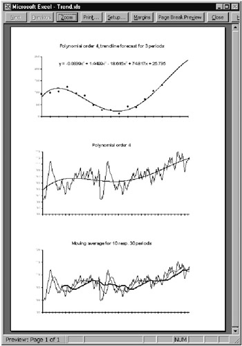
Figure 10-1: Three examples of trend lines
Error Indication
Data series in two-dimensional charts can be provided with error indicators (error bars). These are small lines that specify the range in which the actual value of a data point is to be found if statistical error of measurement is taken into account.
Printing
When it comes to printing a chart two variants must be considered: If the chart is embedded in a worksheet, then printing is accomplished by way of printing the worksheet. Here the only problem is that Excel does not give much thought to where page breaks are inserted, and even a small chart might find itself broken into four pieces. It does not hurt to check the page preview before printing. You may find yourself compelled to insert some hard page breaks to optimize printing (Insert|Page Break).
On the other hand, if the chart is located in a chart sheet, or if you wish to print an embedded chart that has been selected with a mouse click, then there are some options available in the dialog PAGE SETUP. The most important of these is "Printed chart size" on the CHART page of this dialog. In the standard setting Excel uses the entire page. If the chart does not happen to have the same format as the page, the chart can become completely distorted. Therefore, it is usually better to select the option "Scale to fit page." Excel enlarges the chart only to the extent that the relationship between the length and width does not change (that is, the aspect ratio is preserved). The third variant, "Custom," leaves the size of the chart unchanged.
The option "Print in black and white" allows color charts to be printed on a black and white printer. (Most printers can handle this without the use of this option.) Whether with or without this option, you will achieve usable results on a black and white printer only if you refrain from using color in your chart. Use instead differing line widths and types to distinguish among several data series. Since the standard and custom chart types are generally extremely color friendly, the creation of a satisfactory black and white substitute usually requires considerable effort (say, about 100 mouse clicks for a typical chart). Therefore, if this is a common situation for you, then save black and white charts as a custom chart type.
|
|